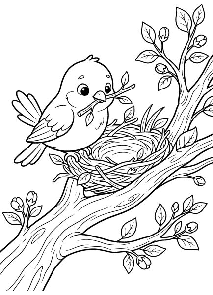
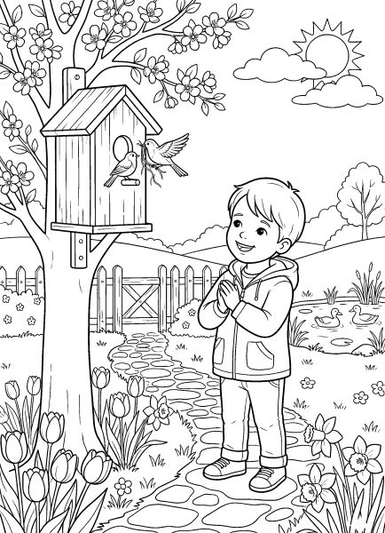
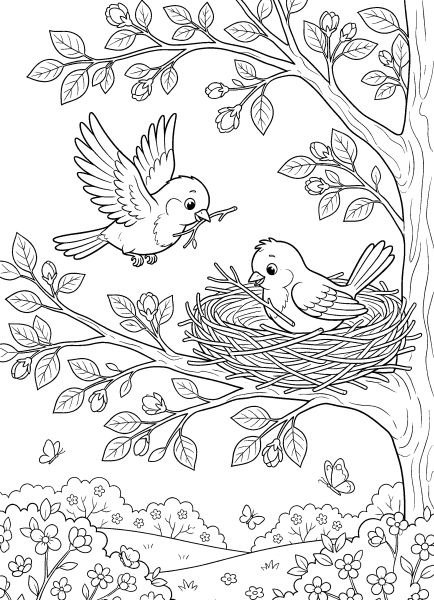
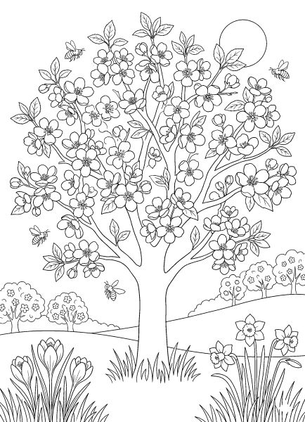
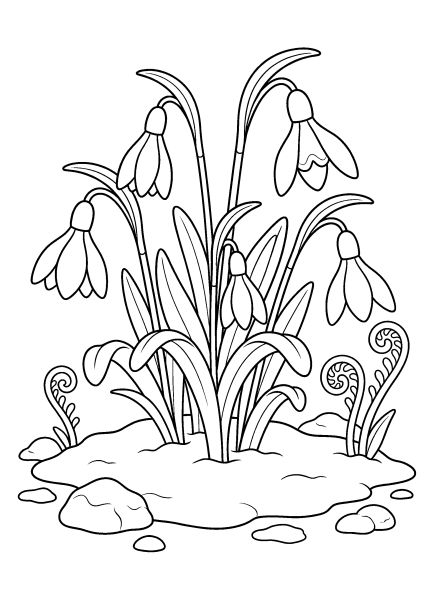
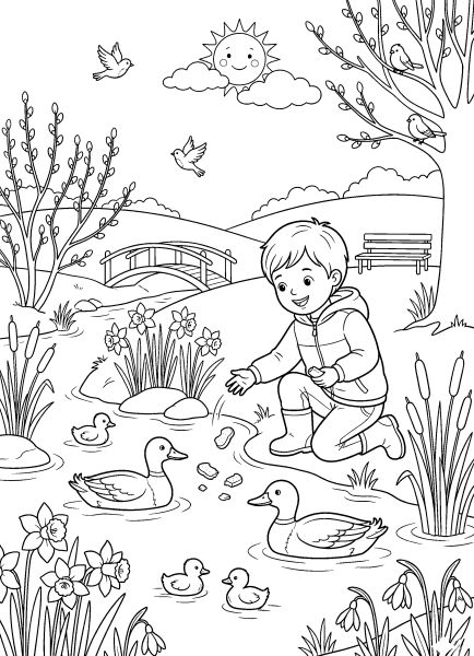
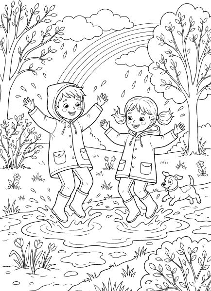
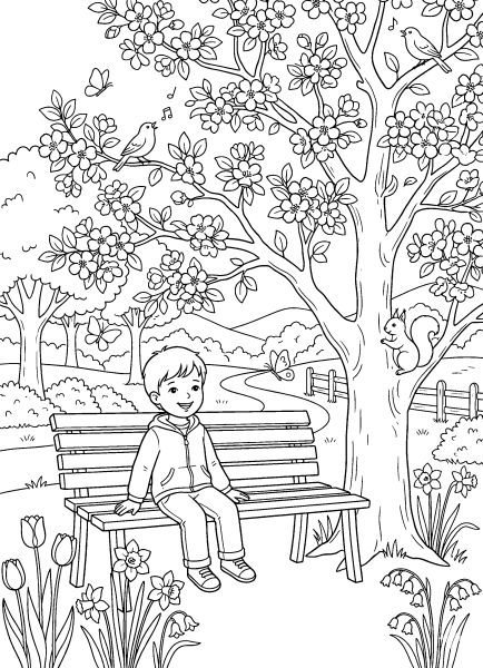
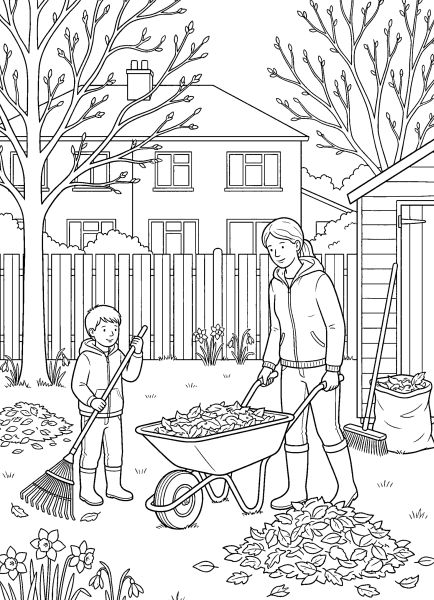
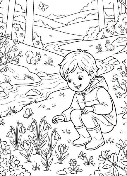
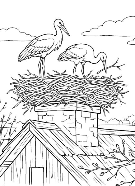
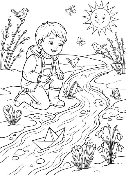
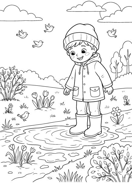
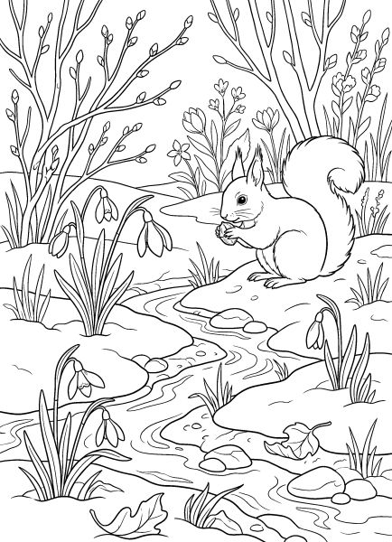
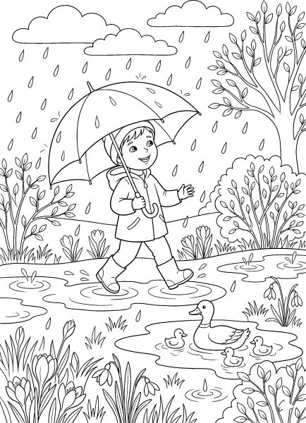
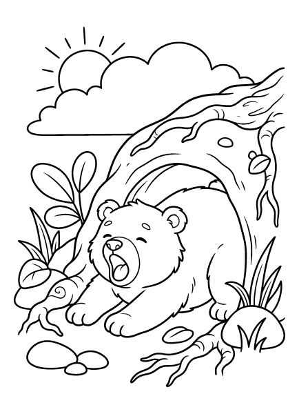
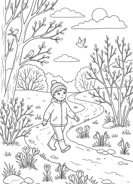
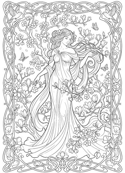
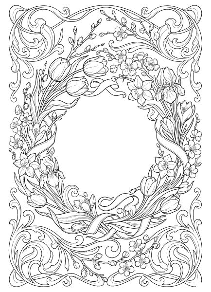
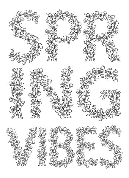
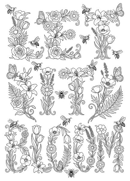
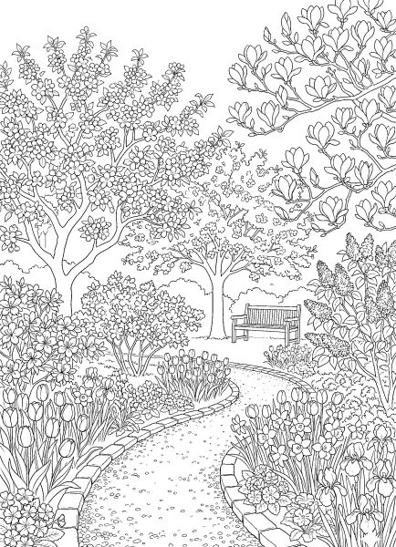
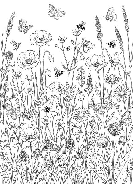
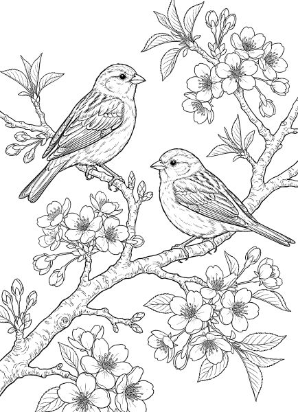
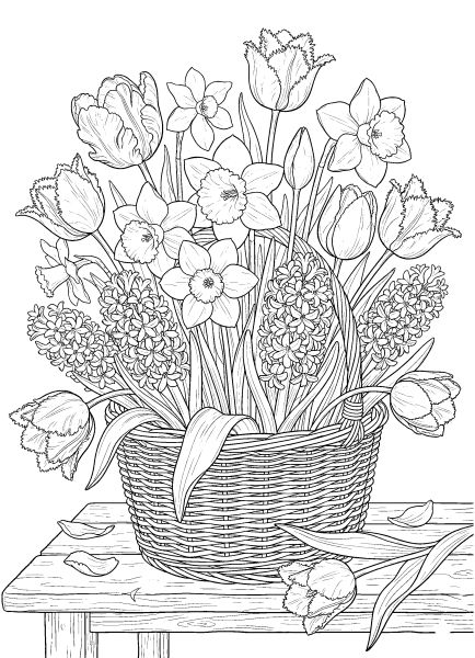
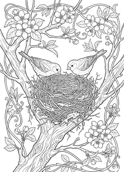
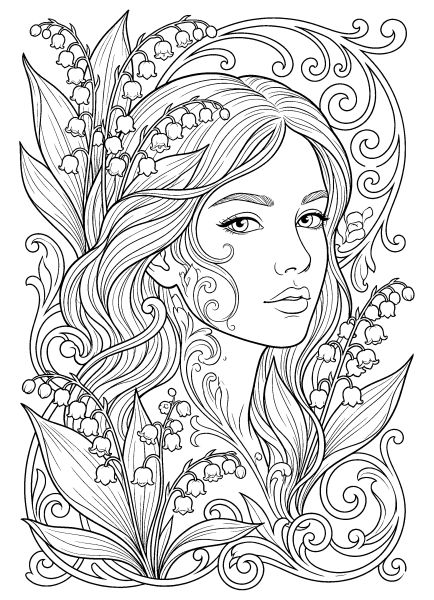
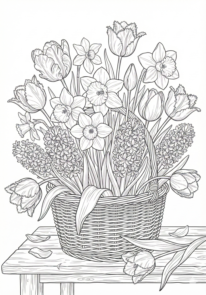
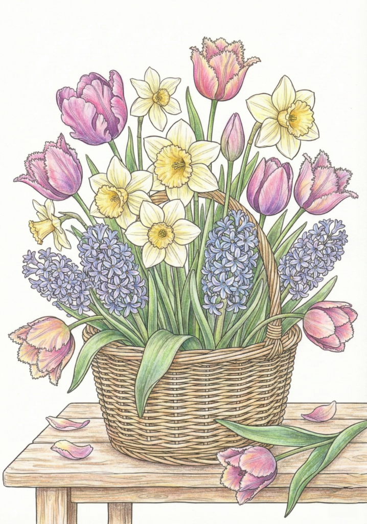
Watching the garden start to bloom again led me to draw this set of free printable spring coloring pages. I saved these illustrations as high-resolution A4 PDFs with clean, defined lines, making them an enjoyable and relaxing activity for both older children and adults.
The collection focuses on a bright, refreshing mood, featuring everything from detailed floral arrangements to quiet outdoor scenes. Further down the page, you’ll find colored inspiration along with two step-by-step tutorials for pencils and markers to help you blend vibrant seasonal colors. Feel free to explore the designs below.
Sometimes it helps to start by choosing a color palette first. For spring, this could be soft greens, light pinks, or gentle yellow tones. Once your colors are set, the coloring process feels much easier and more relaxed.
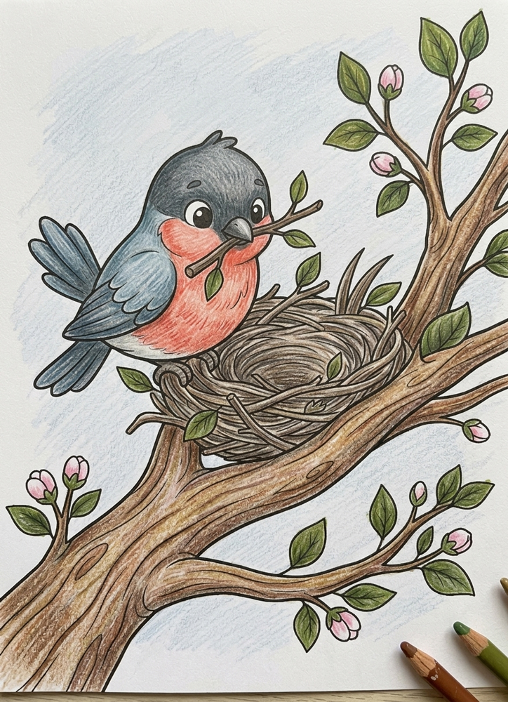
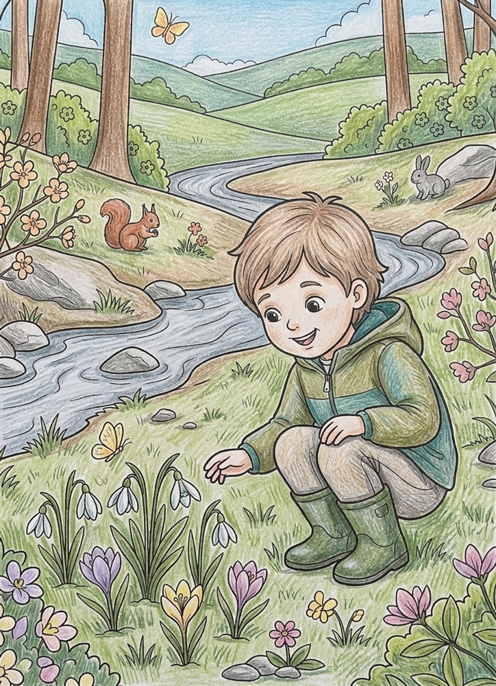
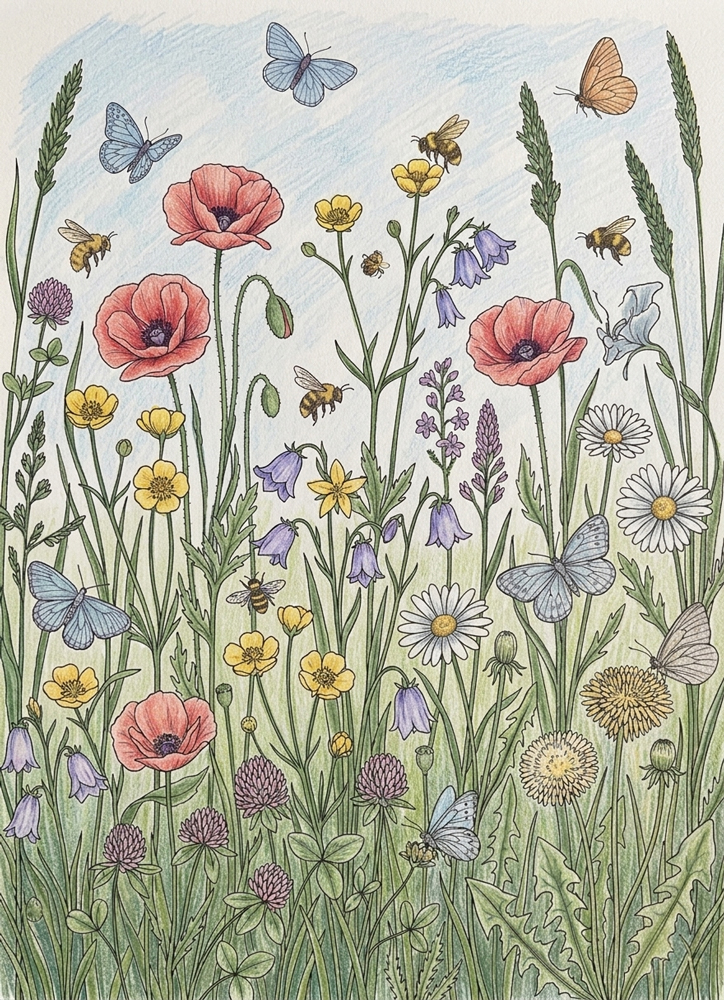
Below are colored examples from the spring coloring pages collection. You can use them to explore color combinations and ideas, but there is no need to copy them exactly. Click on any image to enlarge and explore the details up close. Scroll down, there is a step-by-step tutorial below.
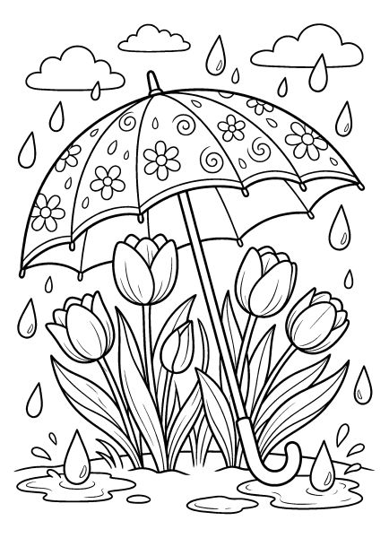
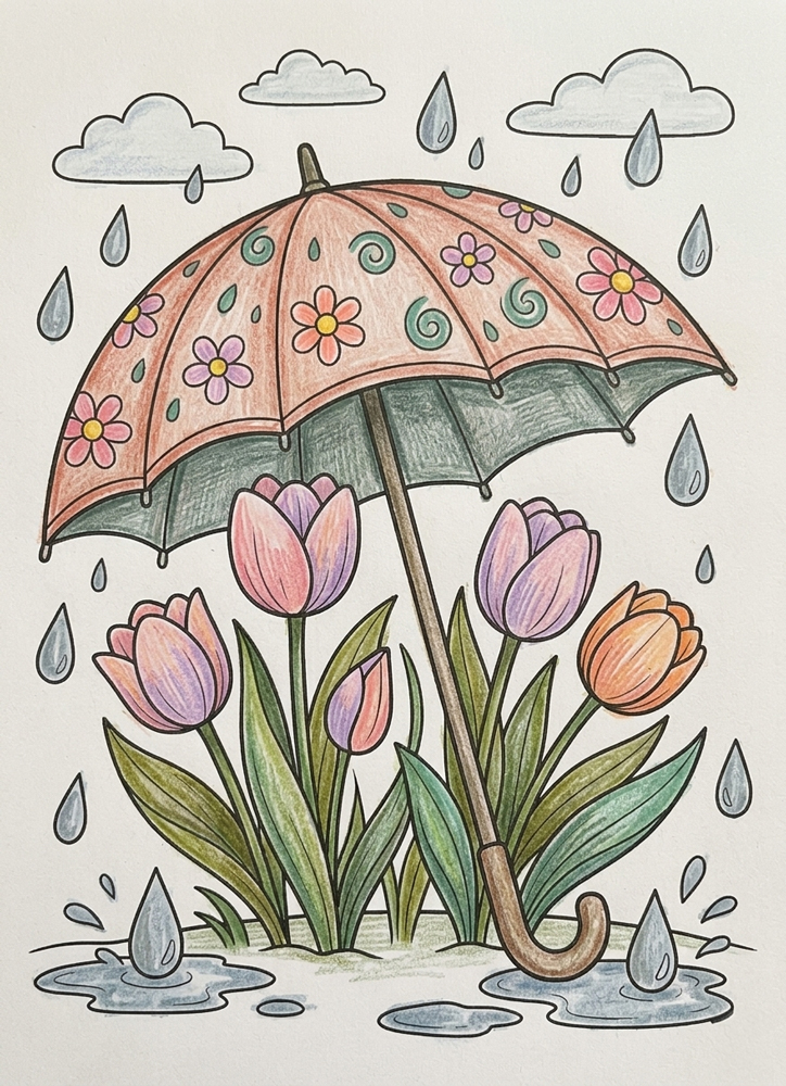
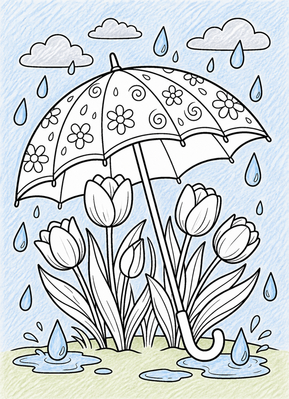
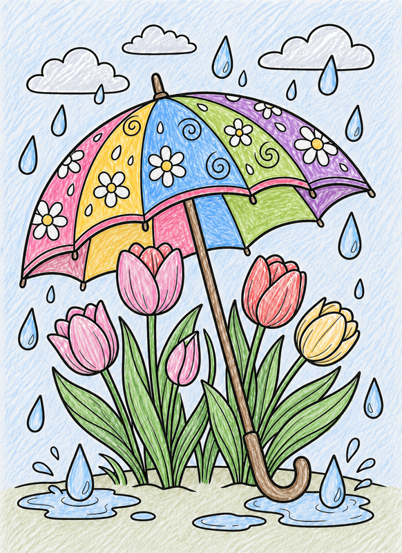
This scene looks detailed at first, but once you begin, it becomes very easy to follow.
We’ll go one step at a time — first the soft background, then the flowers and umbrella, and after that we’ll add a bit of depth and light.
Just take it slowly, don’t rush, and enjoy the process. You’ll see how the whole picture comes together little by little.
🌧️ Step 1 — Start with the Background
Let’s begin with everything in the background.
Take a very light blue and gently fill in the sky and the raindrops. For the clouds, use a soft gray or a pale blue.
Then move to the ground and puddles. Use light green or beige and fill them in with simple, even strokes.
Keep your hand light and let the pencil strokes stay visible — no need to smooth anything out.
Make sure all these areas are filled, but leave the umbrella and the flowers completely untouched.
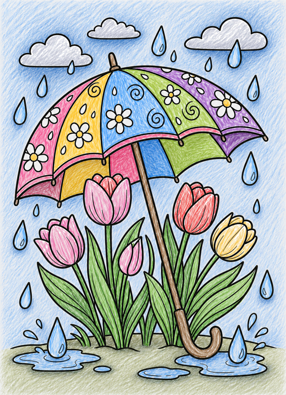
🌷 Step 2 — Color the Tulips
Now let’s move to the flowers.
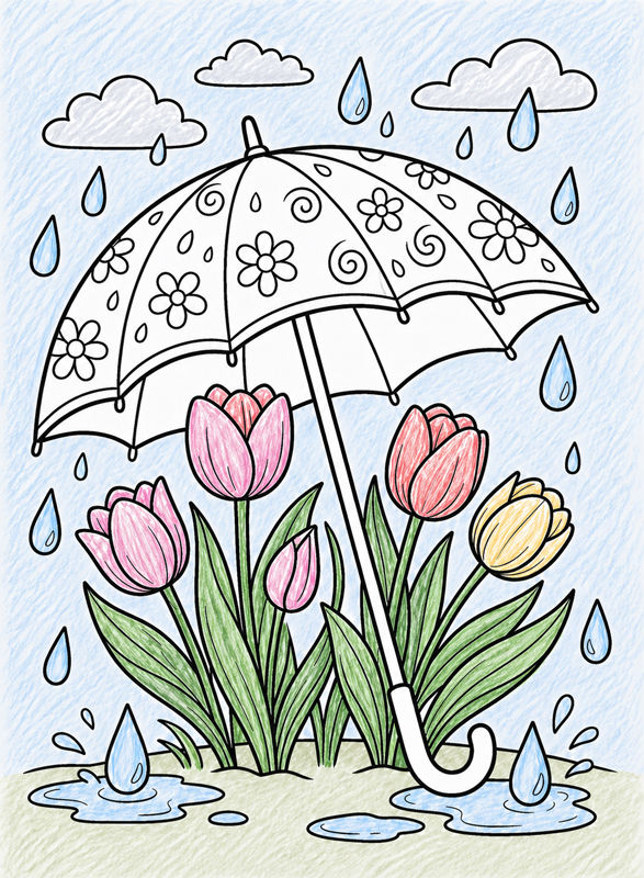
Pick a few bright colors for the petals — red, pink, or yellow — and gently fill them in one by one.
Then use a medium green for the leaves and stems. Take your time and color each part fully so there are no white spots left.
Keep everything simple and even for now — just a clean base color with visible pencil strokes.
Leave the umbrella and the background just as they are.
☂️ Step 3 — Color the Umbrella
Now let’s make the umbrella bright and fun.
Choose different colors for each section — yellow, blue, pink, green, or any combination you like. Fill each panel one by one.
Use brown or gray for the handle and color it in with the same light, even strokes.
Keep each section neat and separate. No shading yet — just clean, flat color.
Leave the flowers and the background exactly as they are.
🌧️ Step 4 — Add Depth to the Background
Now let’s give the background a bit more depth.
Take slightly darker versions of the same colors and go over a few areas — under the clouds, inside the puddles, around the raindrops, and near the base of the plants.
Use clear, visible strokes and build the color little by little. You don’t need to cover large areas — just add darker touches where it feels natural.
Keep the strokes simple and don’t try to blend them out.
Leave the flowers and the umbrella just as they are.
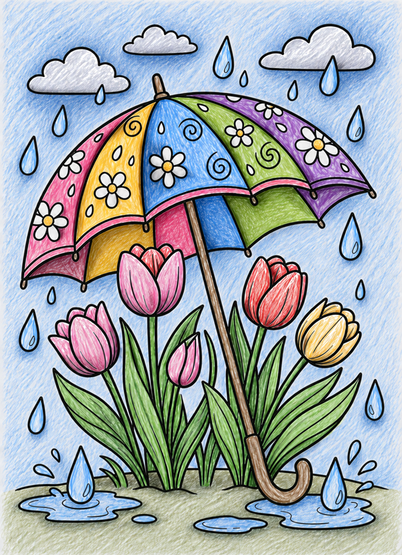
🌸 Step 5 — Add Shadows to the Flowers and Umbrella
Now let’s give the flowers and the umbrella a bit more shape.
Take darker versions of the same colors and add shadows in the deeper areas — under the petals, between the leaves, and along the stems.
On the umbrella, add darker strokes under the edges and between the panels so it doesn’t look flat.
Use short, clear strokes and press a bit more this time so the shadows are easy to see.
Keep everything simple and don’t try to blend — the visible strokes are what create the depth.
Spring visuals in our collection are defined by flow, lightness, and a sense of awakening. Unlike the dense structures of autumn, spring scenes prioritize movement and air, perfectly suited for a fresh coloring experience. Key characteristics include:
Gentle Curves: Lines follow the natural, organic direction of stems, vines, and new growth.
Continuous Growth: Shapes overlap gracefully without feeling crowded, creating a sense of life moving forward.
Strategic Detail: Intricate patterns are concentrated around blossoms and young leaves, while the surrounding areas remain open.
This careful balance between detail and negative space reinforces the airy, “breathable” character of spring. In our vertical A4 layouts, this approach allows the eye to rest and ensures that the coloring process remains light and joyful.
Color Palette and Seasonal Mood
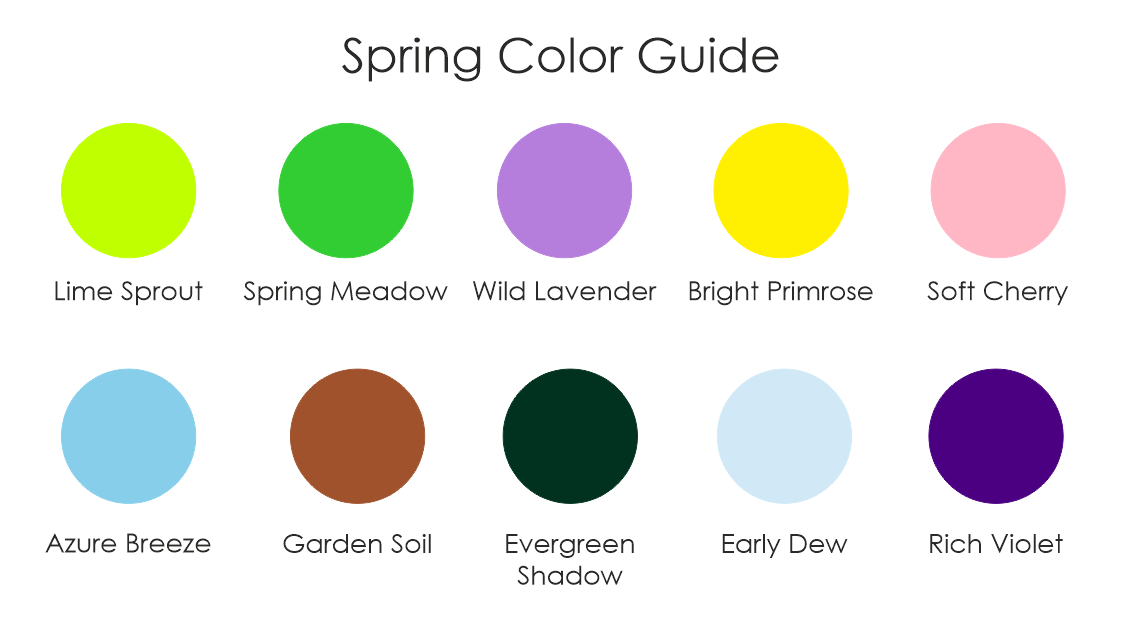
The spring palette is built around freshness, clarity, and gentle contrast. To maintain the airy feel of the season, we recommend using colors in light, transparent layers rather than heavy, solid fills. Each shade helps bring the awakening of nature to your page:
Lime Sprout & Spring Meadow: Our primary greens, perfect for depicting new leaves and active growth.
Bright Primrose & Soft Cherry: Bring essential warmth and a pop of color to flowers and budding plants.
Wild Lavender: Adds calm floral accents and a subtle, sophisticated contrast.
Azure Breeze & Early Dew: Keep backgrounds light, breathable, and full of sky-like clarity.
Garden Soil: Gently grounds stems and roots without darkening the overall scene.
Evergreen Shadow & Rich Violet: Use these sparingly to anchor focal points and add depth where needed.
Together, these tones create a lively but balanced spring atmosphere, encouraging a joyful and creative coloring experience.
Coloring Techniques
Main Technique: Light Layering with Controlled Pressure
Spring illustrations benefit from a delicate touch and precise pressure control. To capture the transparency of new petals and the soft glow of morning light, we recommend a “misty” approach to coloring.
1. The Gentle Start
Begin with very soft, circular applications of Lime Sprout or Azure Breeze. The goal is to let the white of the paper breathe through the pigment. This creates a natural highlight effect and keeps the vertical A4 composition feeling airy and light.
2. Building Soft Transitions
Gradually build color in overlapping areas using Spring Meadow or Soft Cherry. By keeping your pressure light, these colors will blend seamlessly on the paper, creating smooth, painterly transitions rather than hard, segmented edges.
Artistic Tip: Avoid heavy burnishing (pressing hard to fill the paper’s tooth). For spring scenes, a soft, “watercolored” look is much more effective than a saturated, heavy wax finish.
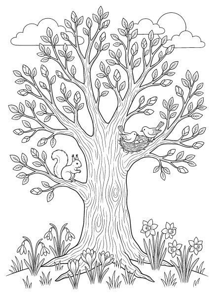
Colored Example
This example shows how gradual layering keeps botanical elements fresh and dimensional without making the image feel heavy.
Video Lesson
This embedded lesson demonstrates light layering and pressure control techniques specifically suited for botanical spring coloring. Instead of covering the surface quickly, focus on how color is built slowly, layer by layer, and how highlights are preserved to create a sense of luminosity and fresh morning light.
Artistic Composition and Detail Balance
Spring compositions in our collection rely on selective focus. Most of the detail is concentrated in the flowers and new leaves, while the backgrounds remain open and airy. We recommend using soft tones like Early Dew or Azure Breeze for the surrounding space.
This approach keeps the scene calm and allows your brighter floral colors to stand out naturally in our vertical A4 format, preventing visual fatigue and making the coloring process truly joyful.
Practical Application: How to Use These Spring Coloring Pages
These spring-themed illustrations are versatile and well-suited for a variety of creative needs:
Education: Perfect for classroom activities about plant growth, life cycles, and seasonal changes.
Well-being: Ideal for calm creative sessions that encourage relaxation, positivity, and mindfulness.
Skill Building: Great for art lessons focused on color harmony and the “light layering” technique.
Versatility: Suitable for both independent and guided coloring across different age groups.
Technical Standards and Download Information
All Spring Coloring Pages are provided as high-resolution printable PDFs designed for a professional finish. Each page features:
Clean, single-weight black line art optimized for precision.
Thoughtful spacing that ensures a comfortable coloring experience.
Standard vertical A4 format for easy home printing.
For the best results, print at 100% scale on 120–160 gsm paper. Browse the gallery below, click Download, and start bringing the freshness of spring to life!
Enjoying these free coloring pages?
Your support helps keep this free printable library growing.
The support amount starts at $3, but you can change it before donating. You can also choose one-time or monthly support.
If you enjoyed bringing these fresh spring scenes to life, your creative journey through our seasonal themes is just beginning. Experience the golden beauty of the harvest with our Fall coloring pages, dive into the mystery of the Halloween collection, or celebrate the winter magic with our Christmas designs. For those who love the elegance of nature’s creatures found in spring meadows, we highly recommend our Realistic Cat coloring pages, where every detail captures the grace of the animal world.
Let these blooming illustrations inspire your palette—from fresh, vibrant greens and soft floral pastels to the deep, atmospheric tones of the changing seasons.