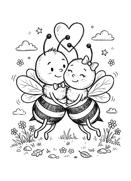
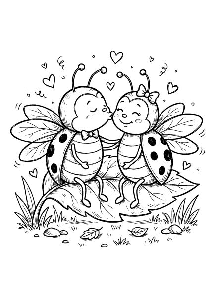
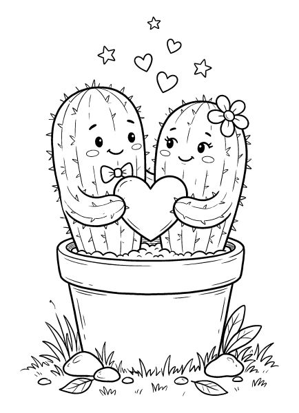
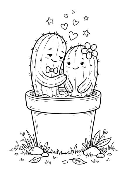
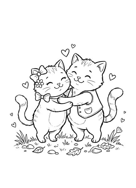
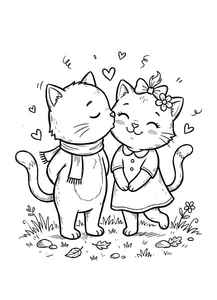
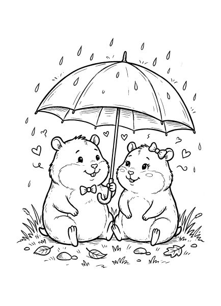
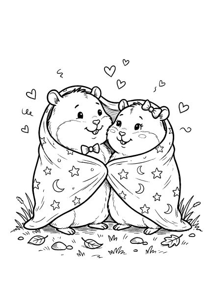
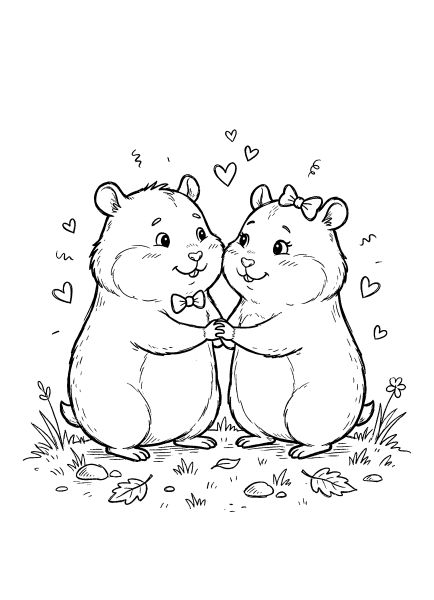
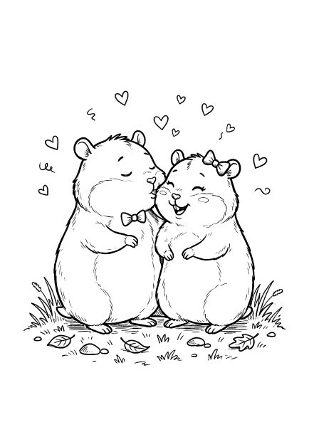
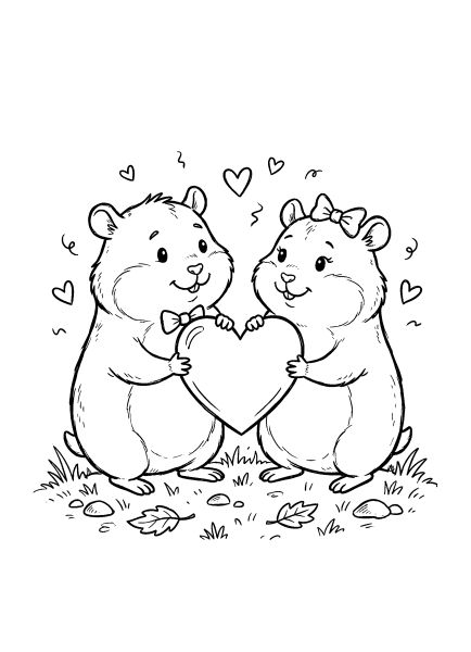
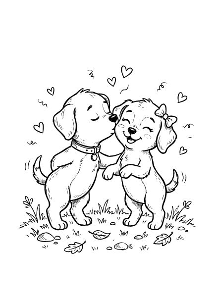
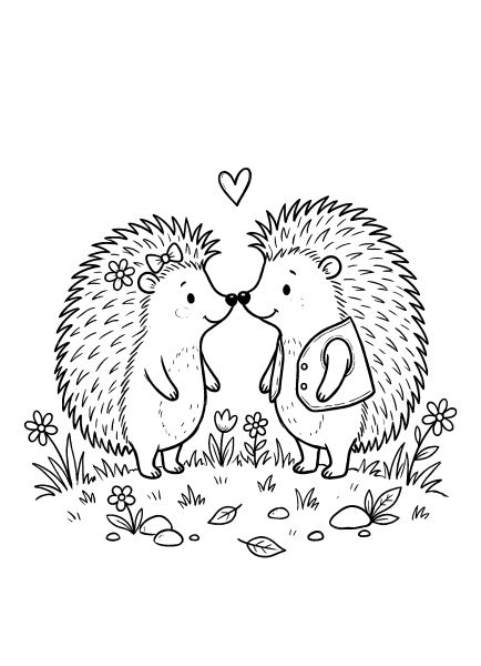
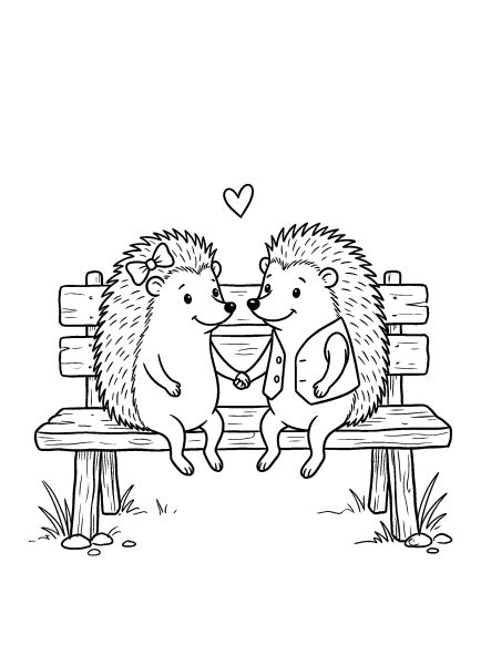
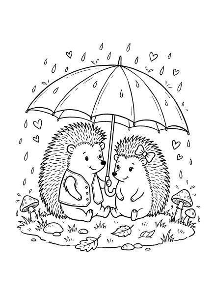
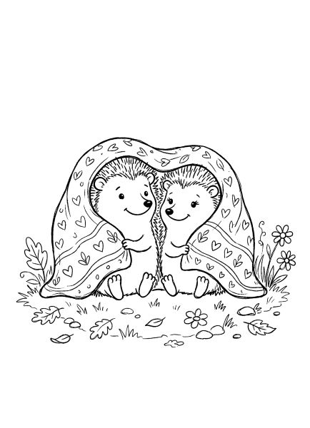
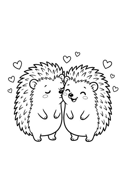
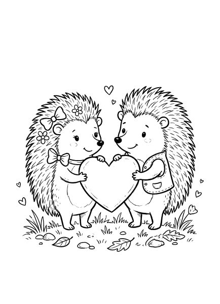
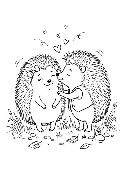
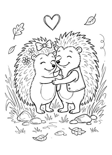
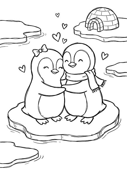
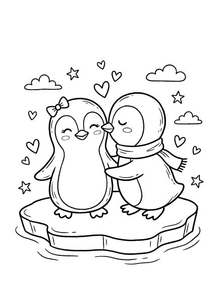
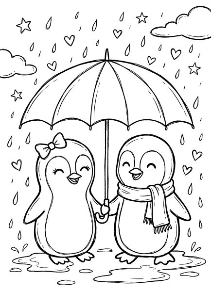
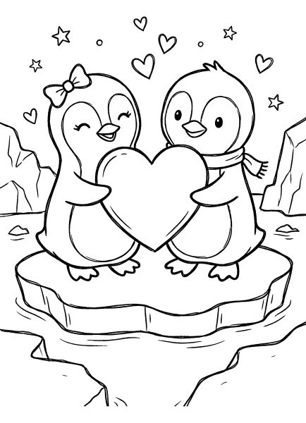
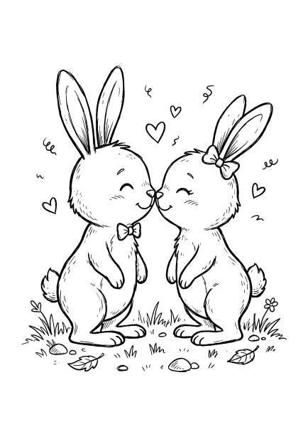
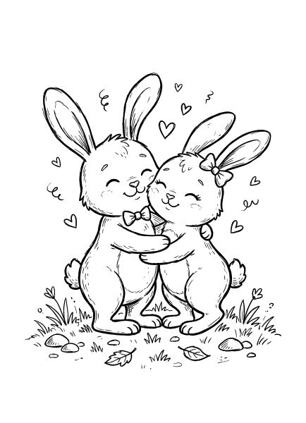
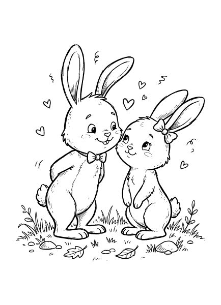
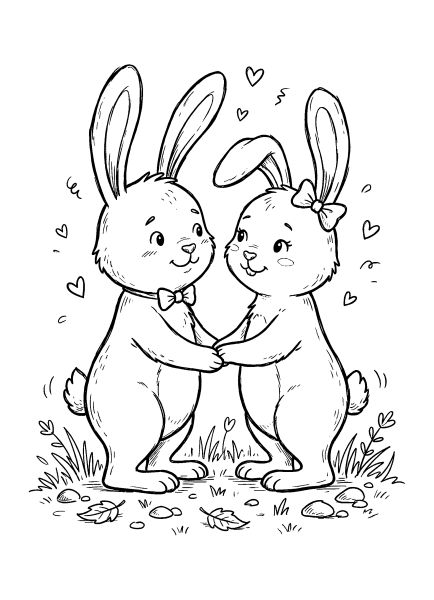
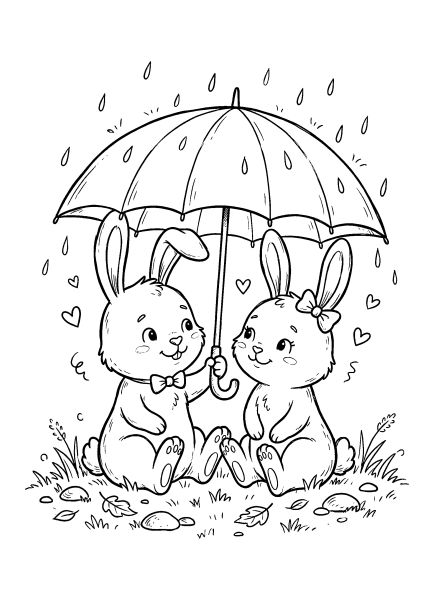
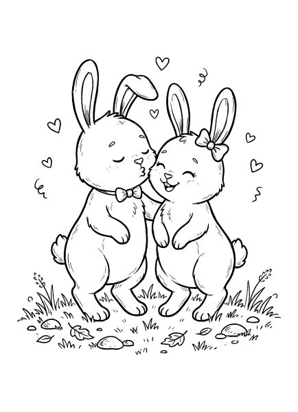
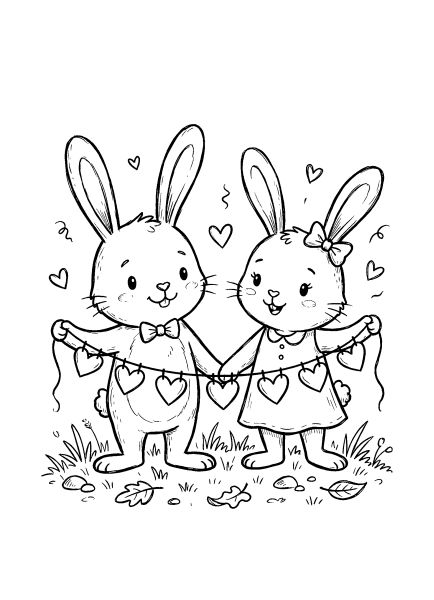
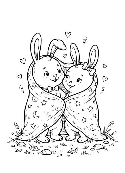
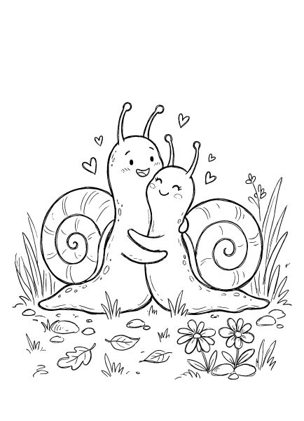
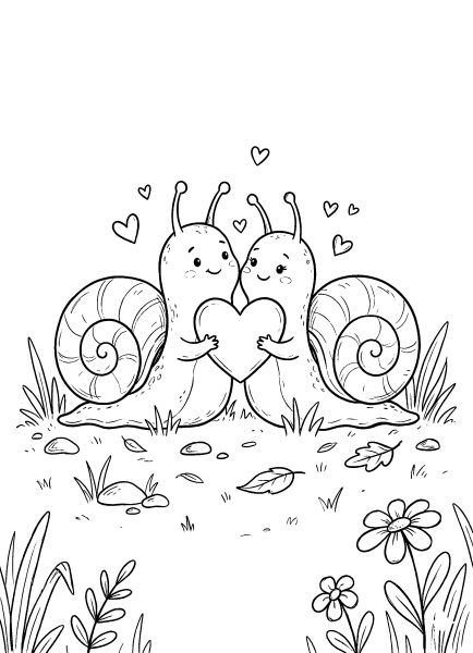

Valentine’s Day Coloring Pages
🎨 Coloring Tips & Inspiration
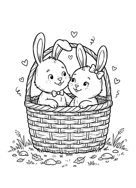
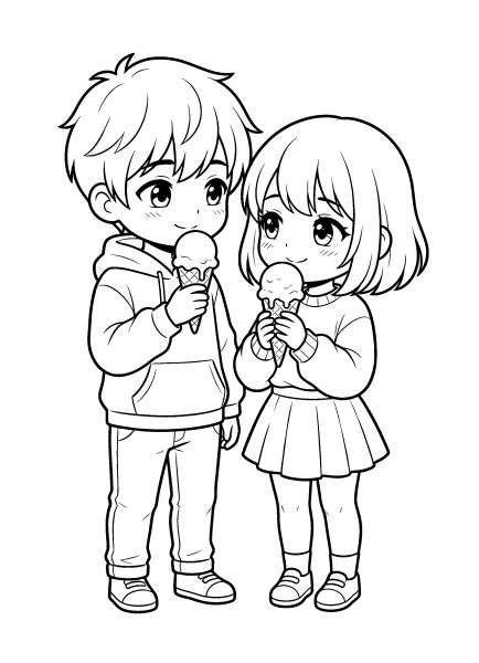
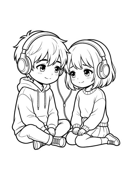
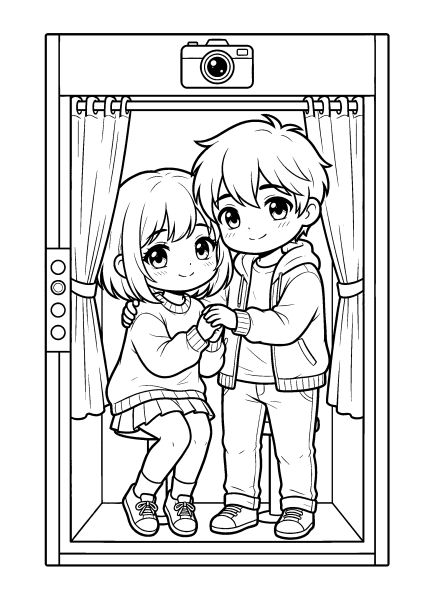
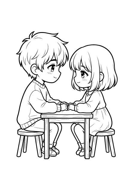
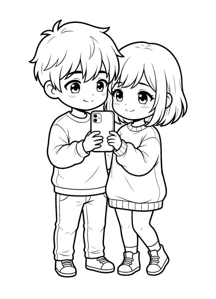
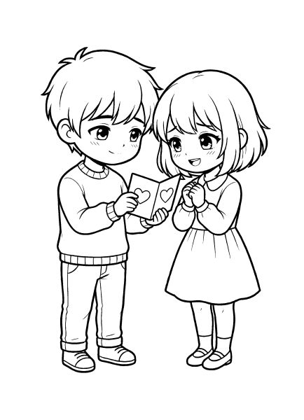
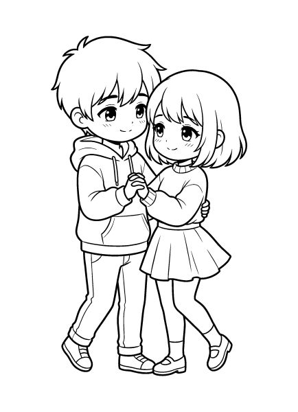
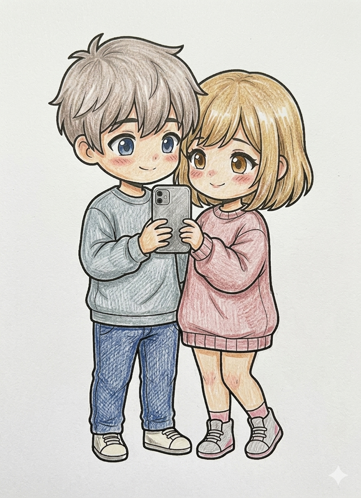
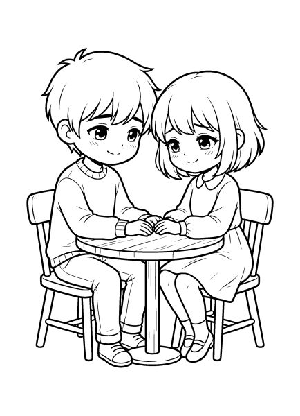
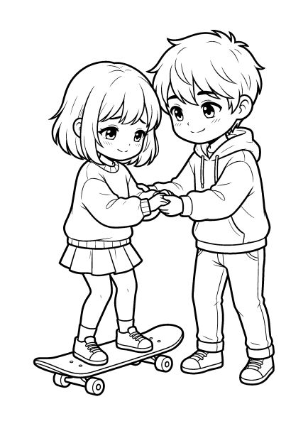
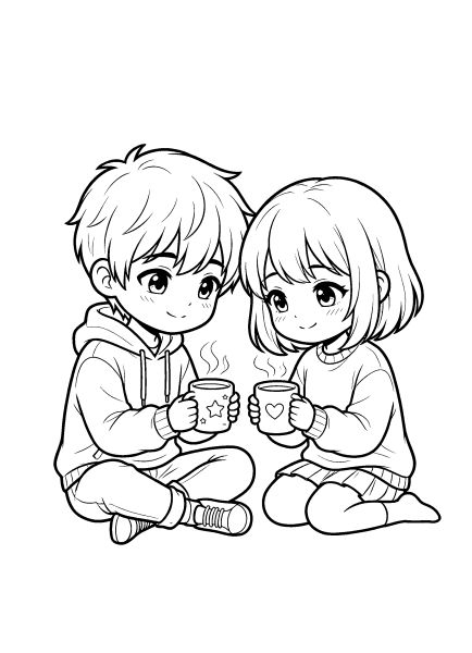
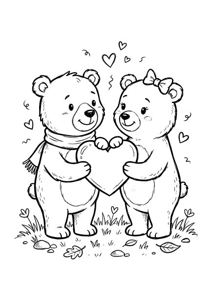
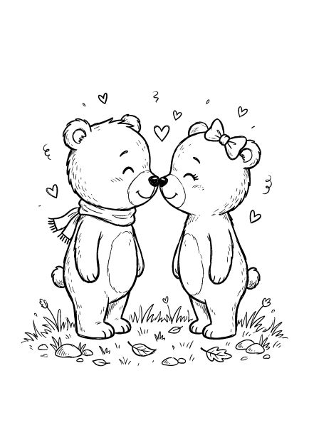
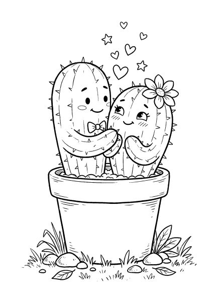
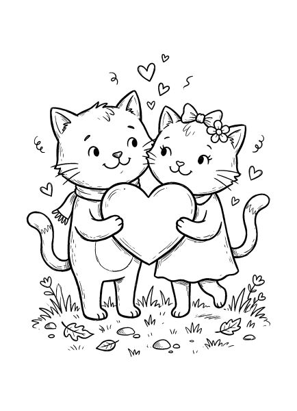
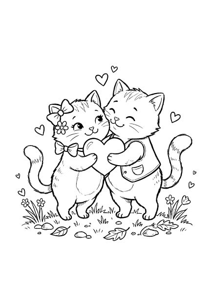
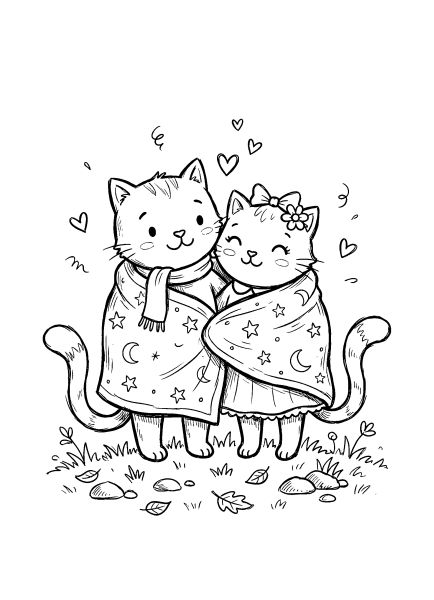
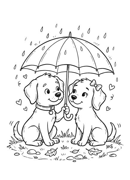
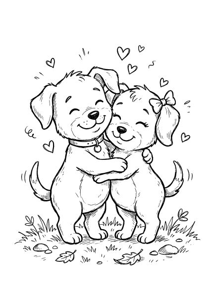
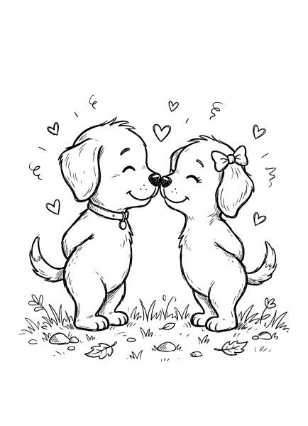
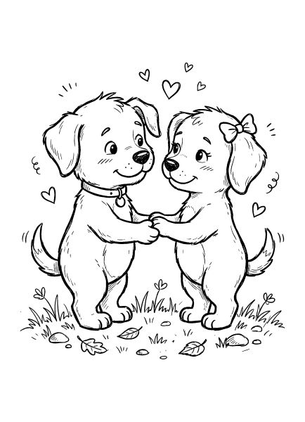
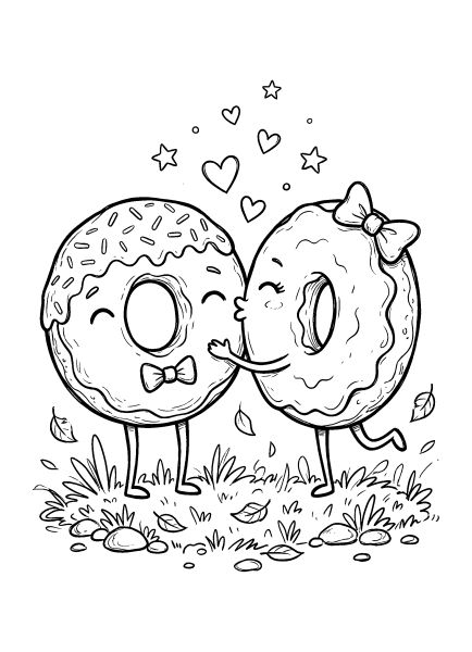
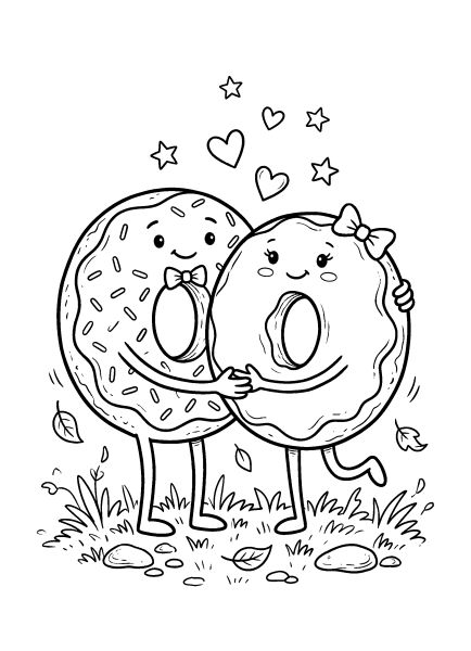
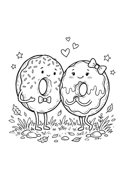
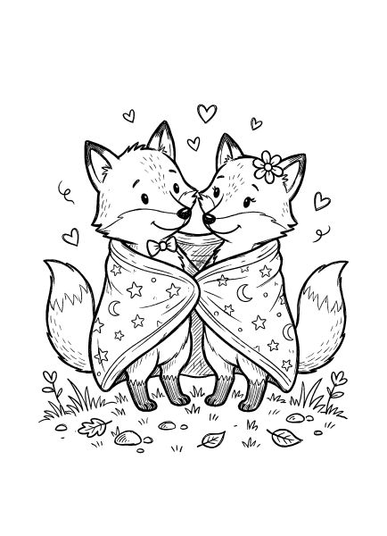
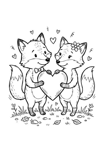
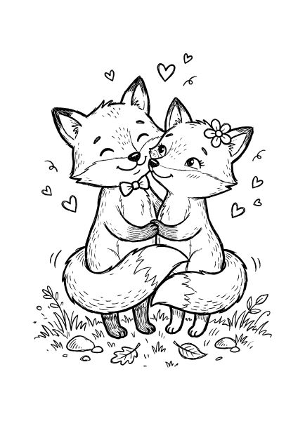
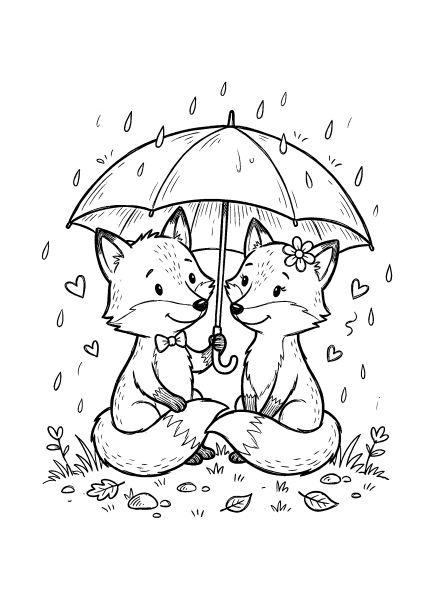
Pages like these are easy to get into because each design can look different in color. Hearts, cards, and cute characters can be kept soft and gentle or made bright and playful. Even if you simply color the drawing neatly without complex effects, it will already look beautiful and complete.
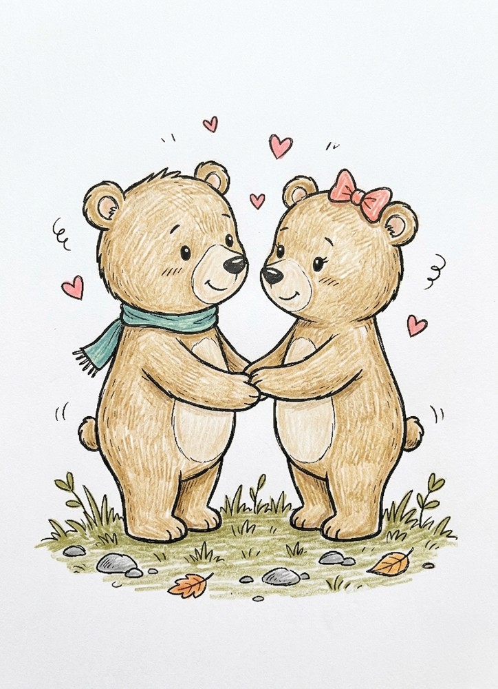
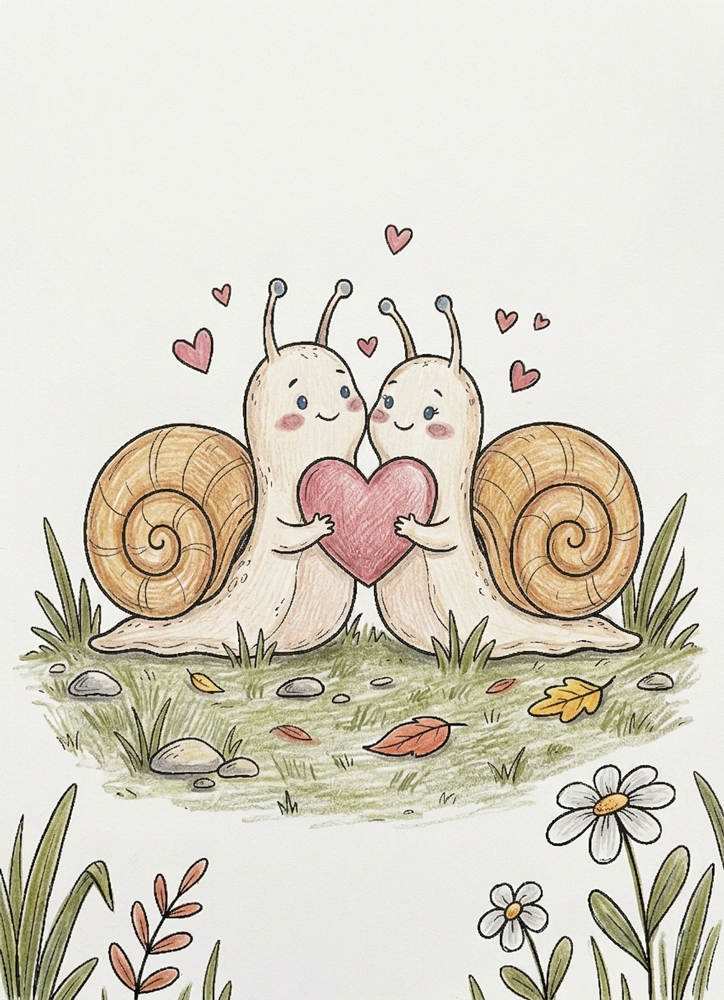
Below are a few colored examples from the Valentine’s Day coloring pages collection. Use them as a source of ideas and pick what you like most. Click on any image to enlarge and explore the details up close. Scroll down, there is a step-by-step tutorial below.
🎨 Coloring Tips & Inspiration
Unicorns give you a lot of creative freedom. You can keep them soft and pastel, make them bright and colorful, or choose completely unexpected color combinations. Even without complex effects or shading, the drawing already looks beautiful when you simply color it neatly in colors you enjoy.
Below are a few colored examples from the unicorn coloring pages collection. Use them as a source of ideas and pick what feels right to you. Click on any image to enlarge and explore the details up close. Scroll down, there is a step-by-step tutorial below.
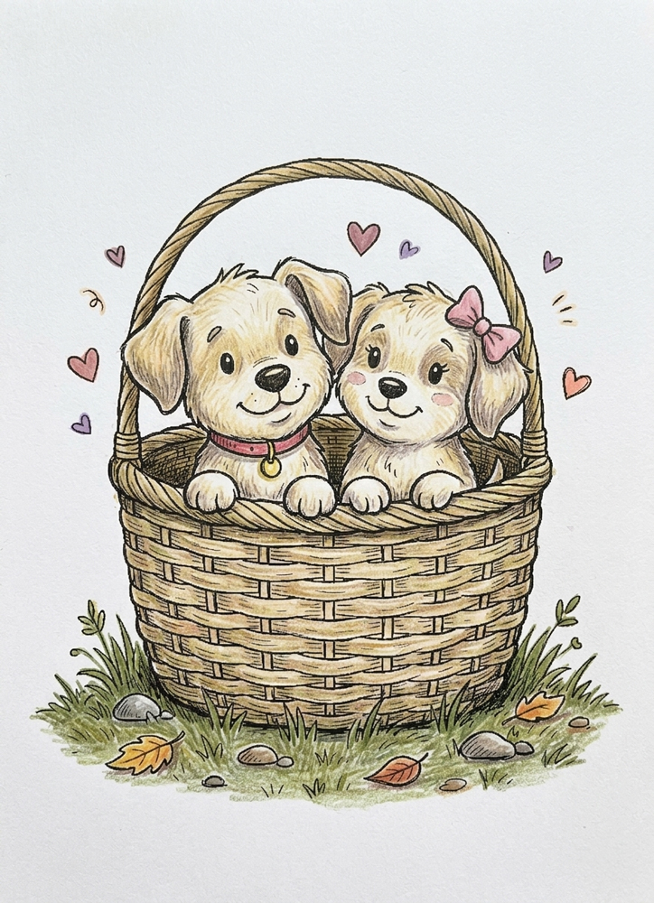
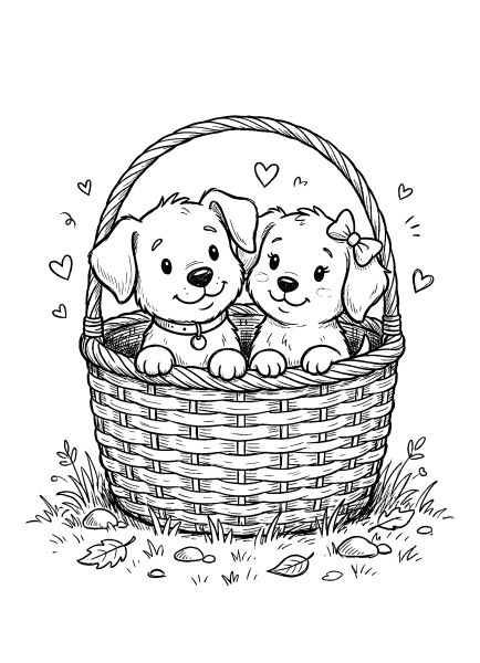
🐶 Coloring Puppies in a Basket Step by Step
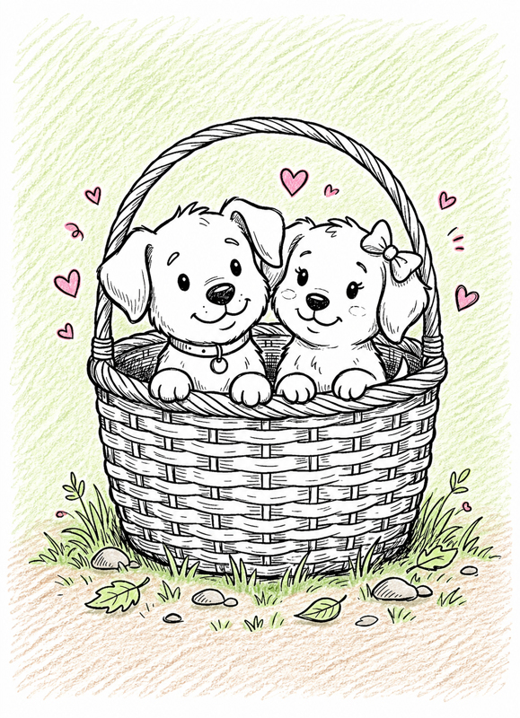
This is one of those drawings that looks detailed at first, but once you start, it becomes very easy to follow.
We’ll go step by step — first the background, then the puppies, then the basket, and after that we’ll add a bit of depth and light.
Take it slowly, don’t rush, and enjoy the process. Little by little, everything will come together into a soft, finished picture.
🌿 Step 1 — Start with the Background
Let’s begin with everything around the puppies.
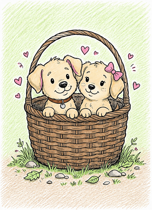
Take a light green and gently fill in the grass, leaves, and small plants. Then use a soft brown or beige for the ground.
For the hearts, pick a light pink or red and color them in one by one.
Keep your strokes light and visible — no need to smooth anything out.
For now, leave the puppies and the basket completely untouched.
🐶 Step 2 — Color the Puppies
Now let’s bring the puppies to life.
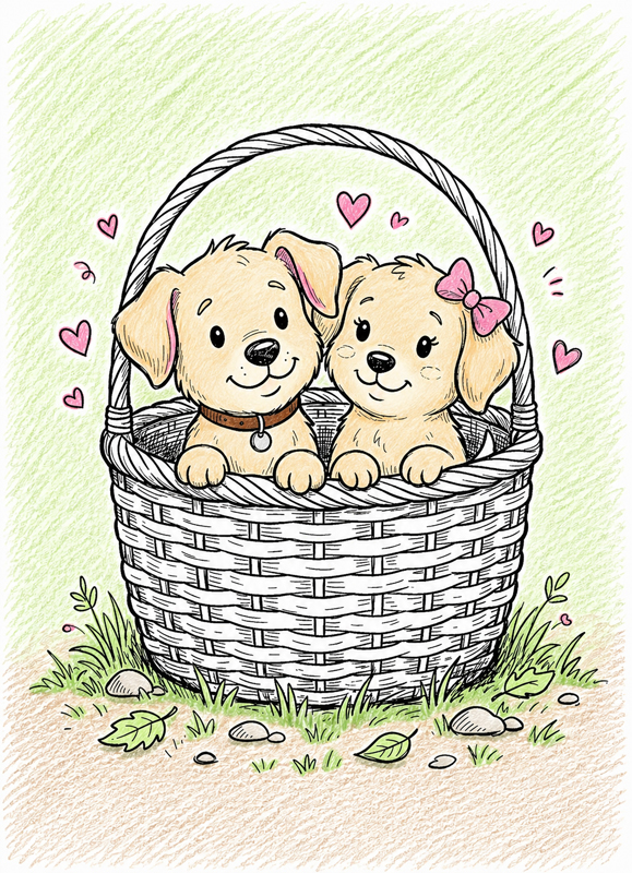
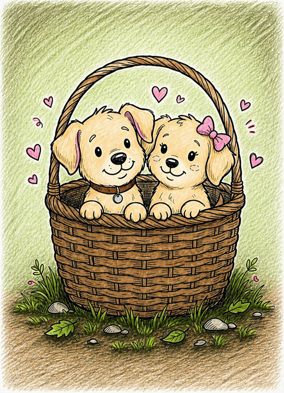
Take a light beige, cream, or soft brown and gently fill in their fur — the heads, ears, bodies, and paws.
Use a soft pink for the inside of the ears, and lightly color the noses as well.
Keep everything simple and even for now — just a clean base color with visible pencil strokes.
Leave the basket and the background just as they are.
🧺 Step 3 — Color the Basket
Now let’s work on the basket.
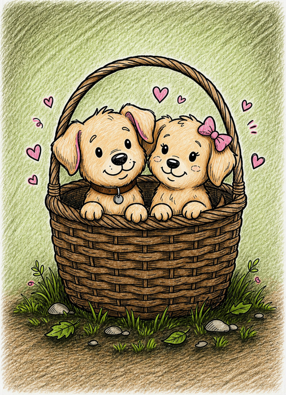
Take a light brown or warm beige and gently fill in the whole basket, including the handle.
As you color, try to follow the direction of the woven lines. This will help the basket look more natural.
Keep your strokes light and even, without adding any shadows yet.
Leave the puppies and the background just as they are.
🌿 Step 4 — Add Shadows to the Background
Now let’s make the basket feel like it is really sitting on the ground.
Take darker shades of the colors you already used for the grass and ground. Add the strongest shadow right under the basket, especially where it touches the ground.
Then add a few darker strokes inside the thicker grass and under some of the fallen leaves.
Work in small areas and build the color with short strokes. Keep the darkest part close to the basket, then use fewer strokes as you move away.
Leave the puppies and the basket just as they are.
🐶 Step 5 — Add Shadows to the Puppies and Basket
Now let’s give the puppies and the basket more shape.
Take slightly darker shades of the same colors and add shadows in the deeper areas — under the heads, inside the ears, and under the paws.
On the basket, add darker strokes between the woven lines and under the handle to bring out the texture.
Use short, clear strokes and follow the shape of each part. Press a bit more so the shadows are easy to see.
Don’t blend — those visible strokes are what make everything look more three-dimensional.
✨ Step 6 — Add a Soft Glow
Now let’s add the final bright touch around the puppies.
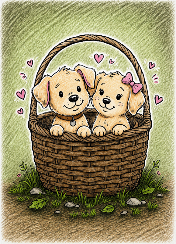
Take a white gel pen and draw a few clear white strokes just outside the puppies’ outlines. Keep them close to the edges, like a soft little glow around them.
Add a few small white accents near the hearts too, so they feel a bit more sparkly.
Keep the white marks bright and clean, and try not to cover the black outlines.
Understanding the Visual Language of the Theme
The visual structure of these storybook-style illustrations relies on rounded silhouettes and a clear central focus. Characters are typically positioned close together, creating a sense of warmth and connection. Key elements include:
- Rounded silhouettes and minimal sharp angles for a “soft” feel.
- Evenly spaced decorative elements like hearts and stars that float around the main subjects.
- Weighted linework that guides color placement without needing complex shading.
Negative space is essential here; the open background allows the main figures to stand out and keeps the vertical A4 composition feeling light and airy.
Coloring Techniques / Approach for This Theme
For a classic “storybook doodle” look, a controlled and minimalist approach works best. We recommend a limited palette of 5 to 7 colors to keep the illustration cohesive.
The “Contact Shadow” Technique
A contact shadow is a small, gentle shadow placed exactly where objects touch. Add these subtle shadows under the chin, beneath blankets, or in the area of an embrace. Use a warm gray or a slightly darker version of your base color — avoid pure black to keep the illustration delicate.
Two-Tone Texture
Instead of complex patterns, create depth by layering just two tones of the same color:
- For fur: a base tone with slightly darker edges.
- For blankets: a base layer with darker folds.
- For faces: keep it simple with a light pink tint for cheeks.
Magical Accents
If using a white gel pen, apply it sparingly. One or two tiny highlight dots in the eyes or on a single heart are enough to suggest a magical, polished finish.
Finish: Leave the background mostly white or add a very soft pastel “halo” around the characters. This preserves the cuteness and keeps the focus exactly where it belongs — on the story being told.

Example Coloring penguin illustration
In the penguin illustration, the large heart clearly serves as the focal point. A warm coral red is used only for the heart, making it the most saturated and eye-catching element in the composition. The penguins themselves are kept in soft grays and creamy tones, which prevents competition with the central shape. Light pink is added gently to the cheeks to enhance warmth without overpowering the faces. Subtle contact shadows appear under the wings, along the lower edges of their bodies, and where they stand on the ice. The ice platform is tinted with a very pale blue-gray, just enough to separate it from the background while preserving openness. The floating hearts above them follow a consistent color rule, reinforcing harmony rather than creating visual noise.
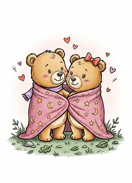
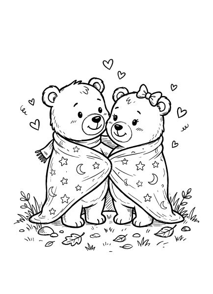
Example Coloring teddy bear illustration
In the teddy bear illustration, the blanket becomes the visual anchor. A soft pink base is applied first, then a slightly deeper pink is layered into the folds to demonstrate the two-tone texture technique. This creates dimension without heavy shading. The bears are colored in warm beige with gentle shading under the chin, between the arms, and along the inner sides of the legs to suggest closeness. The faces remain minimally rendered, with only a light blush on the cheeks and no strong shadows around the eyes. The small decorative hearts are kept in one controlled palette so they feel intentional. The grass beneath the characters receives a soft green layer with a slightly darker tone at the base, grounding the figures while keeping the overall atmosphere light and cohesive.
Artistic Composition and Detail Balance
Each page centers on emotional interaction. The main figures occupy the middle portion of the page, creating a natural focal point that draws the eye. Decorative elements are distributed evenly but do not compete for attention.
Negative space around the characters is a deliberate choice to prevent visual overload. This simplicity supports clean color decisions and controlled shading, making the vertical A4 composition feel balanced and professional.
Practical Application: How to Use
These Valentine’s Day coloring pages are versatile and can be used for:
- handmade Valentine cards and printable decorations
- classroom seasonal activities and quiet art sessions at home
- small framed gifts for friends and family
They are particularly suitable for projects where a soft, cohesive color scheme and a “storybook” feel are desired.
Target Audience: Who These Pages Are Best For
This collection is designed for a wide range of ages. It is best suited for children who enjoy cute animal characters, older kids practicing gentle shading, and teens or adults looking for a calm, light seasonal project.
The designs are moderately detailed but not complex, rewarding careful coloring without requiring advanced blending skills.
Technical Standards and Download Information
All Valentine’s Day coloring pages are available as free printable PDF files. Each file includes:
- clean black outlines (no black fills)
- high-resolution formatting for crisp printing
- A4 and US Letter sizes
Download, print on standard paper, and enjoy a soft, storybook-style coloring experience.
💖 Celebrate Love and More Festive Moments
After sharing the love with these Valentine’s designs, discover the magic of other beloved traditions. Celebrate the joy of the winter season with our Christmas coloring pages, or explore the mysterious side of holidays with our Halloween collections for adults and kids. For those who appreciate elegance and beautiful patterns, our Princess Dress Coloring Pages offer a delightful way to practice sophisticated shading and vibrant color combinations.
Let these heartwarming illustrations inspire your palette—from deep ruby reds and soft pinks to shimmering gold accents.

