
Cozy interiors coloring pages
☕ Cozy Interiors Coloring Pages
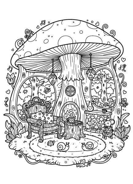
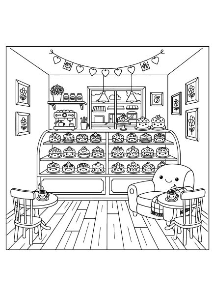
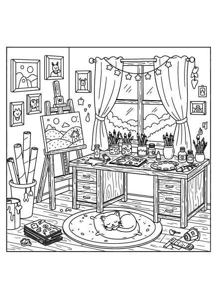
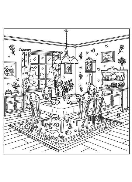
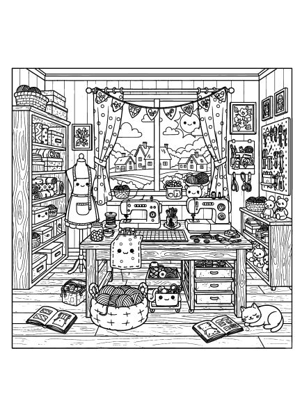
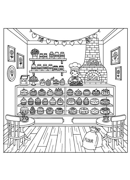
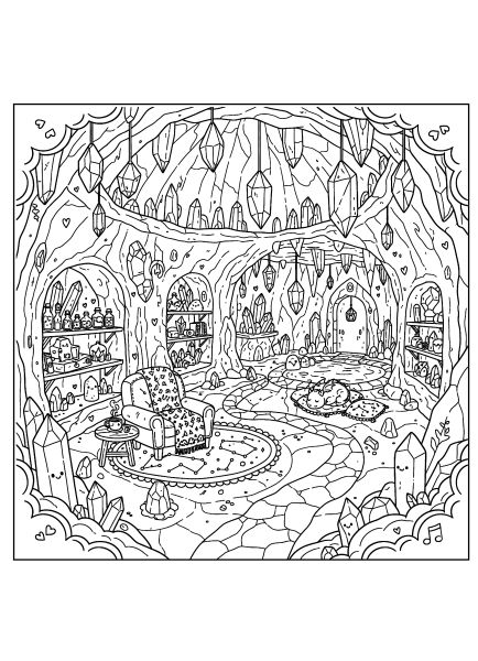
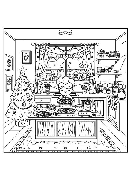
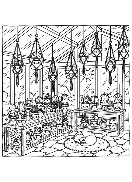
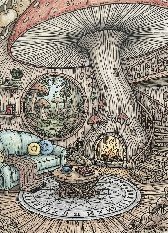
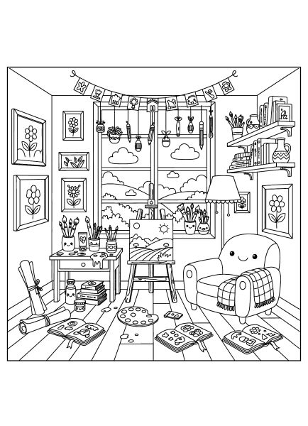
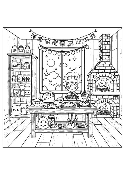
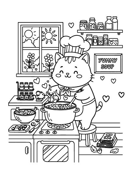
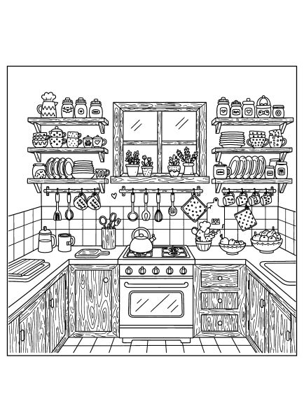
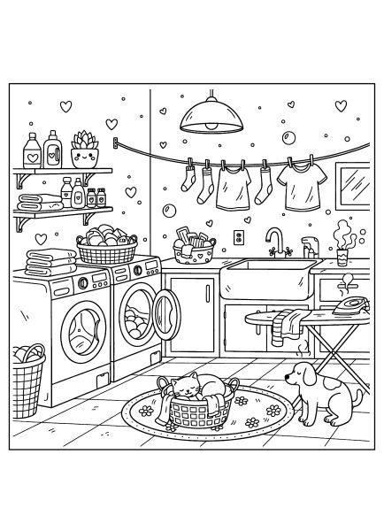
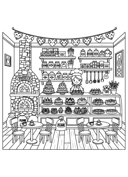
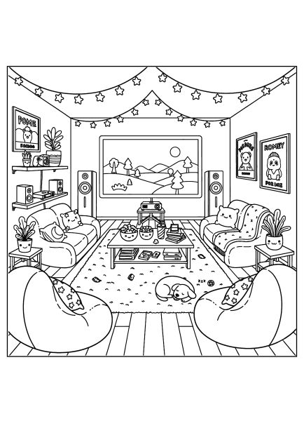
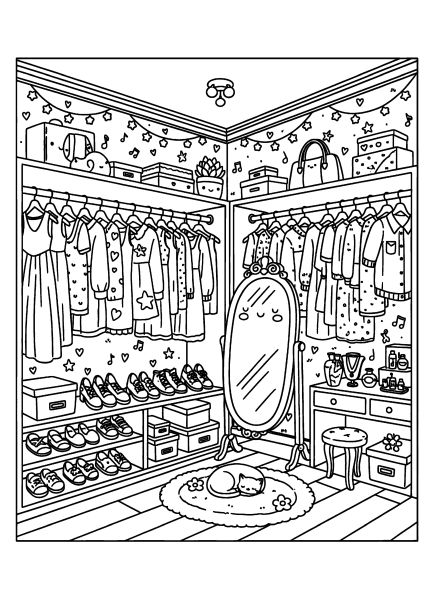
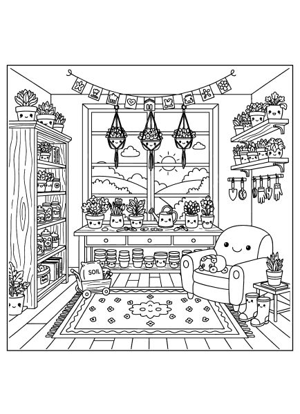
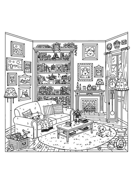
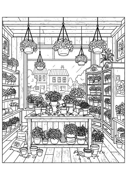
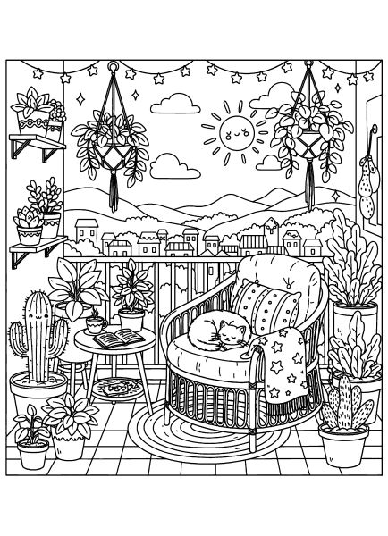
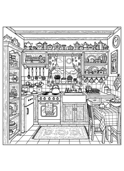
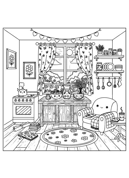
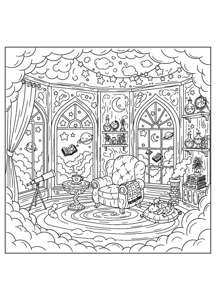
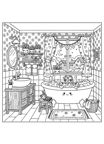
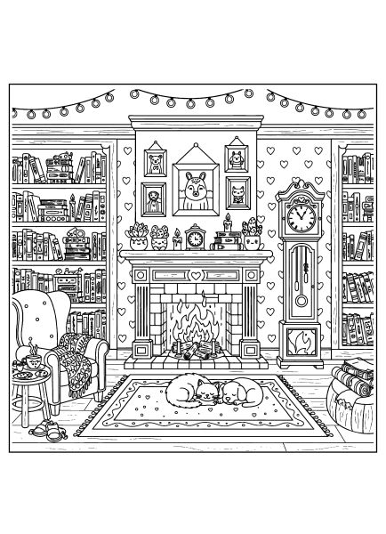
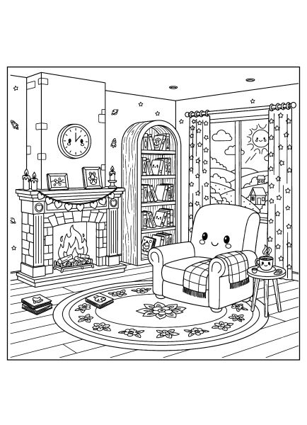
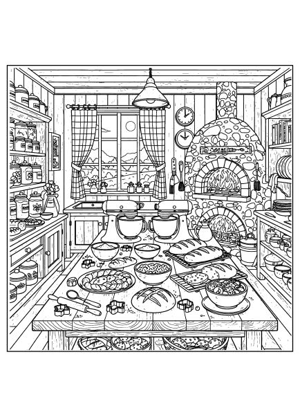
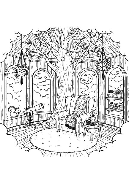
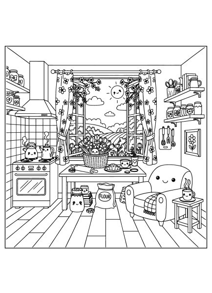
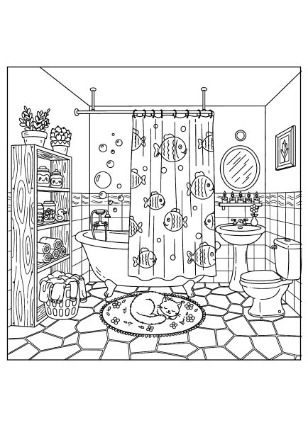
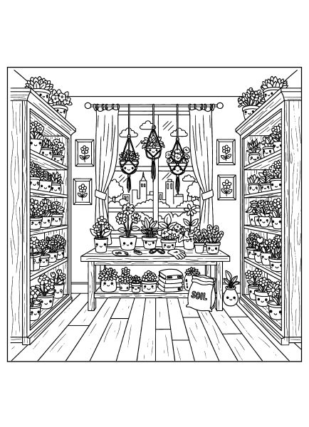
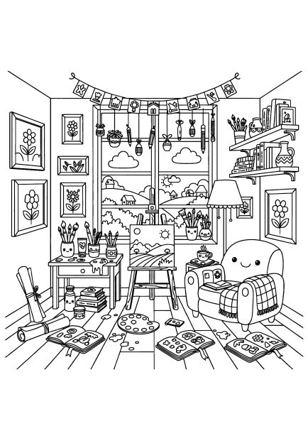
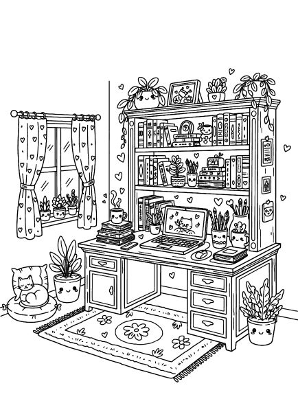
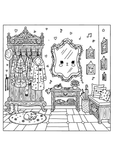
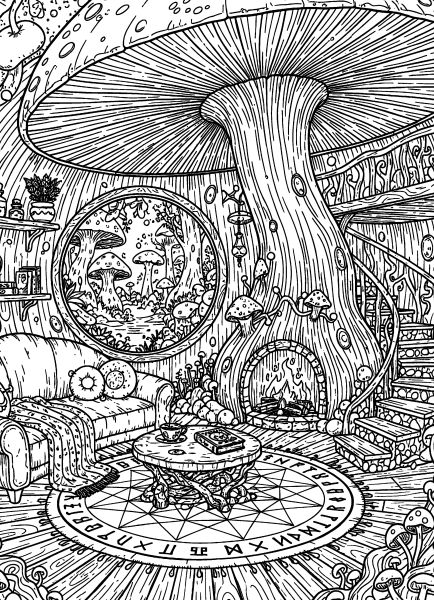
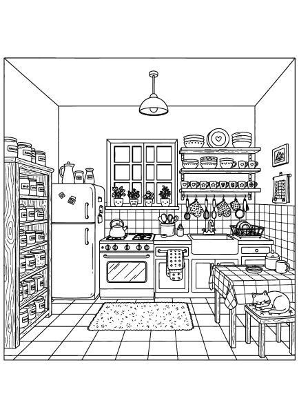
Finding a quiet moment to unwind is a bit easier with these free printable cozy interiors coloring pages, featuring detailed living spaces and reading nooks. I prepared these illustrations for adults and older teens, saving them as high-resolution A4 PDFs with clean, distinct lines for a smooth coloring process.
This set captures the warm, lived-in atmosphere of comfortable rooms, offering plenty of intricate elements like patterned rugs, houseplants, and plush armchairs. Further down the page, I’ve included colored examples and two step-by-step tutorials for markers and pencils to help you render textures like wood and fabric. Take your time browsing the rooms below.
🎨 Coloring Tips & Inspiration
These cozy interiors are full of small details that are fun to explore and bring to life with color. Fabrics, furniture, and objects on shelves can be kept soft and calm or made warmer with richer tones. Even if you simply color the drawing neatly without complex blending, it will already look cozy and complete.
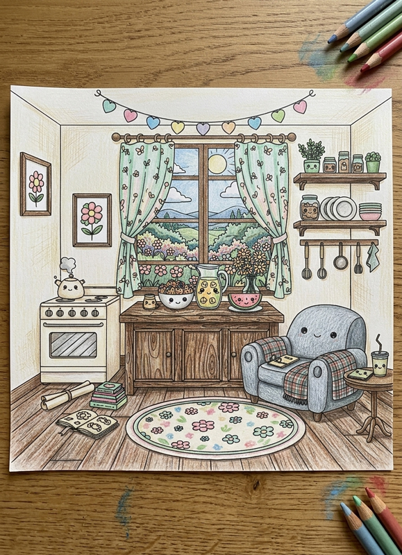
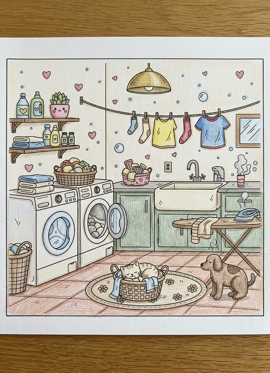
Below are a few colored examples from the cozy interiors coloring pages collection. Use them as a source of ideas and choose what you like most. Click on any image to enlarge and explore the details up close. Scroll down, there is a step-by-step tutorial below.
Understanding the Visual Language of the Theme Cozy interiors coloring pages
The visual structure of these interiors is moderately detailed but balanced. Rooms are framed frontally, with clear perspective lines guiding the eye toward central furniture pieces. Key characteristics include:
- Layered objects: shelves, books, plants, and textiles that add depth.
- Medium-density linework: clear outlines that define space.
- Repeated motifs: small hearts, frames, and decor items that create rhythm.
- Separated functional zones: distinct areas for rest, work, or storage.
Large surfaces like walls and rugs provide open coloring areas, while negative space is present but controlled. These are “filled” rooms that remain calm rather than chaotic, perfectly optimized for our vertical A4 format.
Coloring Techniques / Approach for This Theme
Limited Palette: How to Color Storybook Doodle with Colored Pencils
Choosing just 5–6 colored pencils creates a cohesive, tidy, book-like look. This is especially effective when an illustration contains many small details.
Step 1: Assign Color Roles
Before starting, decide which pencil goes where:
- Wood & Furniture: Light base (beige) + warm gray for shadows.
- Textiles (Curtains, Rugs): One primary main color (e.g., dusty pink).
- Greenery: Sage or muted green.
- Small Accents: One “pop” color (terracotta or red), used on 10–15% of the page.
Step 2: Color from Light to Dark
Start with very light pressure for the first layer. Add a second layer only in shadow areas — under tabletops, behind pots, or in room corners. Avoid pure black; instead, deepen the base color or use a touch of warm gray.
Step 3: Connect Through Repetition
Repeat each color in 2–4 different places. For example, use your main pink on the curtains, a book cover, and a small decorative heart. This builds visual harmony across the entire room.
Step 4: Leave Breathing Space
Do not feel obligated to color every tiny element. Leaving some minor details white or lightly touched prevents visual noise and keeps the illustration feeling airy and calm.
Finish: Add 3–5 darkest points in deep gaps or object overlaps using gray. If you prefer bolder contrast and markers, check out our Whimsical House Coloring Pages – Cartoon Style for a step-by-step guide on saturated marker coloring.

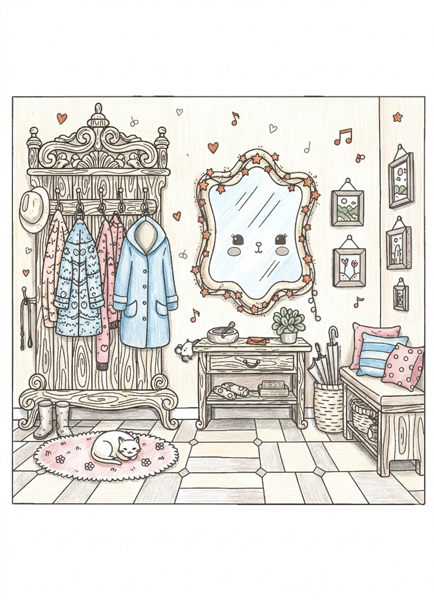
Example Coloring Hallway Interior with Mirror
This example demonstrates how a limited palette keeps a detailed interior calm and cohesive. The wooden furniture is colored in light beige, with warm gray layered gently into corners, under hooks, and along the base of the cabinet to create soft depth. Dusty pink and muted blue are repeated across textiles — coats, pillows, and small decorative elements — so the eye moves naturally around the composition. Notice that many tiny background details are either left white or only lightly tinted. This prevents visual overload and allows the main furniture and mirror to remain the visual anchor of the room. The accent color appears in small hearts and subtle decor pieces, adding warmth without dominating the scene.
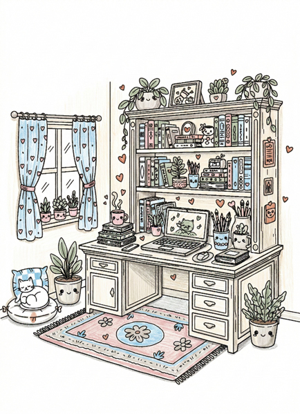
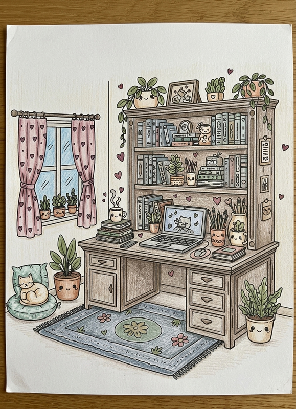
Example Coloring Study Desk with Books and Plants
This example focuses on repetition and balance. Sage green appears across plants, small decorative elements, and subtle details on the rug, tying the composition together. The desk and shelves use a light base tone with slightly darker shading beneath objects and along drawer edges to suggest depth without heavy contrast. Books are not all colored individually in bright tones; instead, selected covers repeat the main palette colors. This prevents the bookshelf from becoming chaotic. The accent color is used sparingly in small motifs, guiding attention without overwhelming the space. The result feels organized, soft, and intentionally composed rather than busy.
Artistic Composition and Detail Balance
Interiors naturally contain many objects, so the key is prioritization. Focus areas often include the largest furniture piece, a central desk, or a window. Secondary details should remain softer; leaving selective white space prevents the room from appearing crowded.
Depth is created through subtle shadow layering rather than high contrast, which maintains the “cozy” feeling of the storybook style in the vertical A4 format.
Practical Application: How to Use
These cozy interior coloring pages are suitable for:
- mindful evening coloring sessions
- classroom discussions about room design and imaginary spaces
- creative journaling inserts and interior color planning experiments
They also serve as excellent inspiration boards for anyone looking to organize or visualize a personal space in a creative way.
Target Audience: Who These Pages Are Best For
This collection is best suited for older children (8+), teens, and adults who enjoy calm, detailed environments. The moderate detail density requires some patience but does not demand advanced blending skills, making it accessible for those who prefer structured compositions.
Technical Standards and Download Information
All cozy interiors coloring pages are provided as free printable PDF files. Each page includes:
- clean black outlines (no black fills)
- balanced line weight for easy coloring
- A4 and US Letter formats
Files are optimized for home printing on standard paper. Download, print, choose a limited palette, and build a harmonious storybook interior scene.
✨ Create Your Own Quiet Haven
After bringing these warm rooms to life, continue your architectural journey through our other charming collections. You might enjoy the bustling street-side charm of our Cute kiosks, or explore the intricate exterior details of our Whimsical House series, available in both Cartoon and Realistic styles. If you love the feeling of a peaceful afternoon spent indoors, don’t miss our Cozy Window Coloring Pages, where every frame offers a new perspective on comfort.
Let these interior scenes inspire your palette—from the soft amber glow of a fireplace to the cool, tranquil tones of a sunlit reading nook.

Cute Kiosks Coloring Pages
Cute kiosk pages feature small shops, market stands, and compact outdoor structures. The scenes highlight variety within a limited space, using repeated elements and decorative details to create visual interest. These pages are ideal for exploring color combinations and small-scale architectural design in a lighthearted, charming setting.

Whimsical House Coloring Pages – Cartoon Style
Cartoon-style whimsical houses focus on simplified shapes and playful proportions. Details are lighter and more expressive, giving each house a friendly and approachable character. This subcategory works well for relaxed coloring sessions and for those who enjoy imaginative architecture without heavy detail density.

Whimsical House Coloring Pages – Realistic Style
These pages present imaginative houses with a more realistic architectural approach. Textures, proportions, and structural details are emphasized, creating scenes that feel grounded while still playful. They are well suited for colorists who enjoy careful shading, material variation, and exploring how light and color interact with detailed structures.

