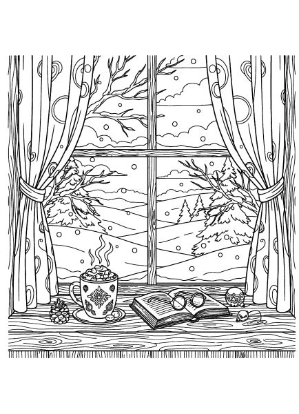
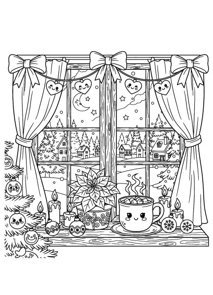
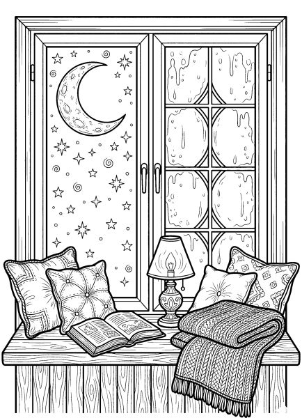
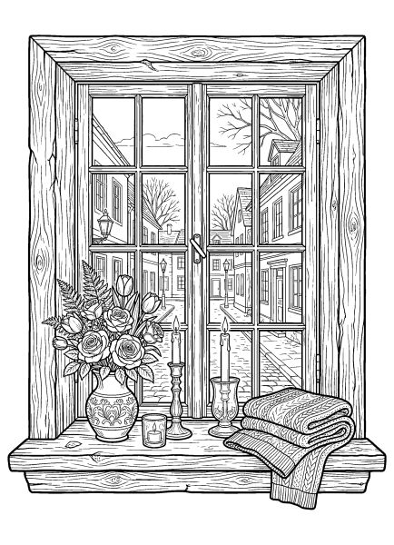
Cozy window coloring pages
🪟 Cozy Window Coloring Pages
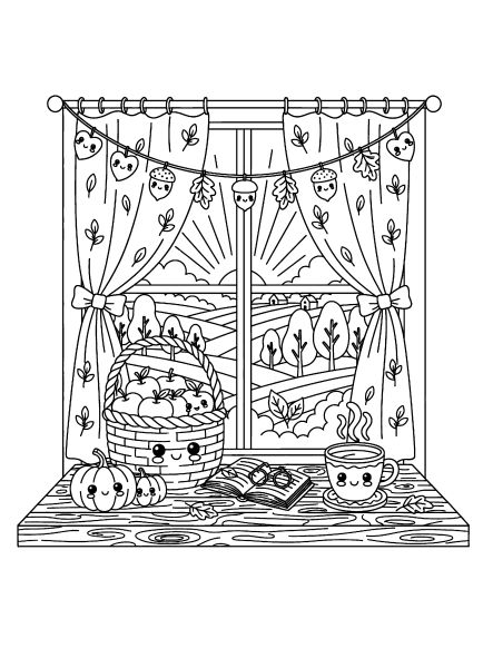
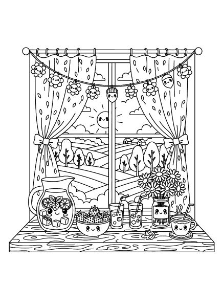
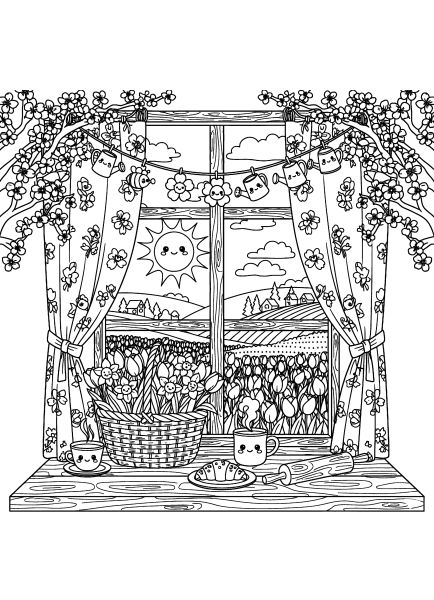
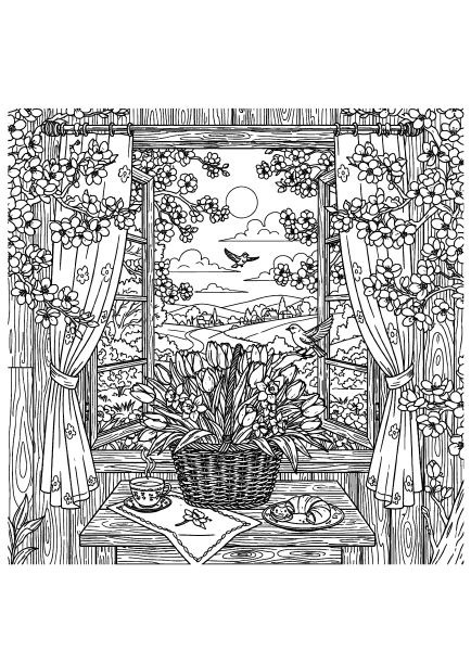
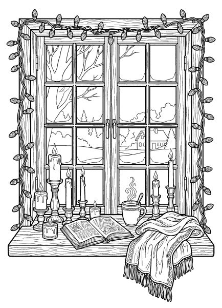
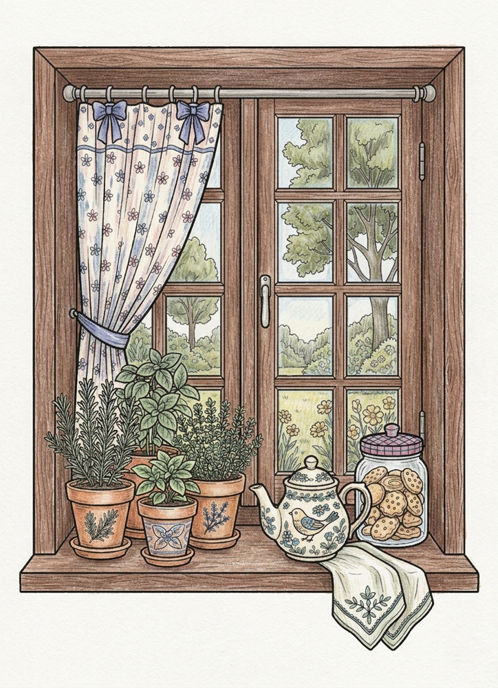
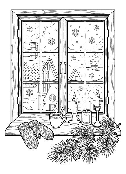
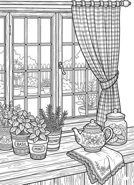
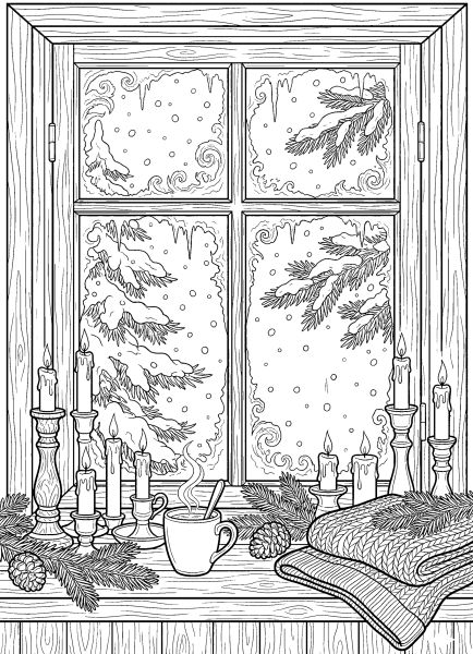
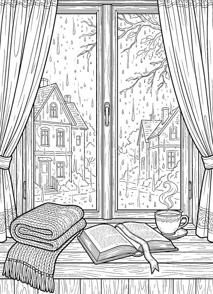
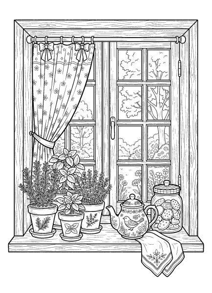
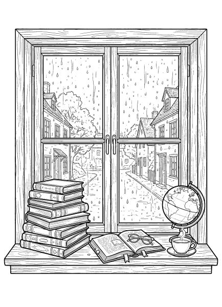
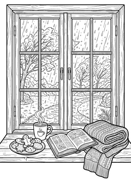
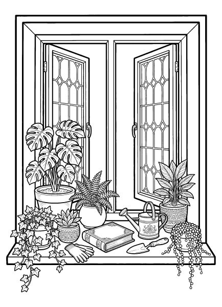
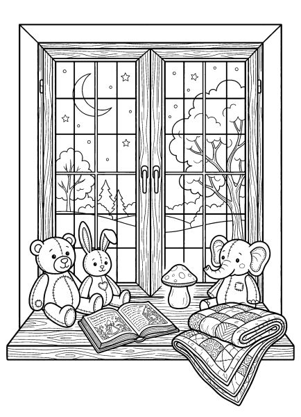
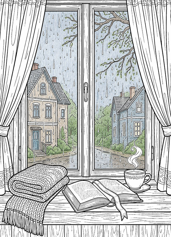
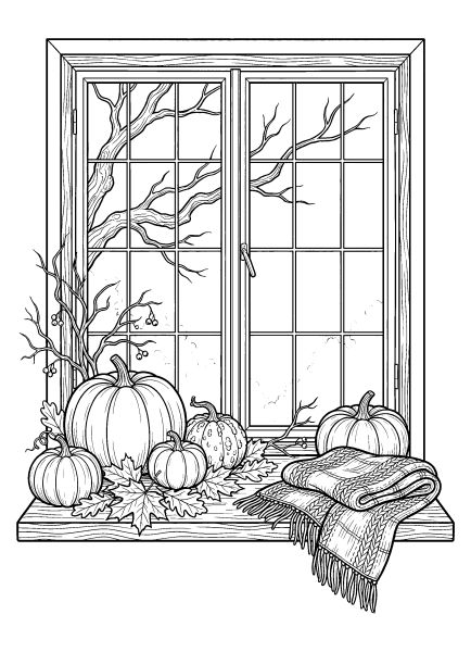
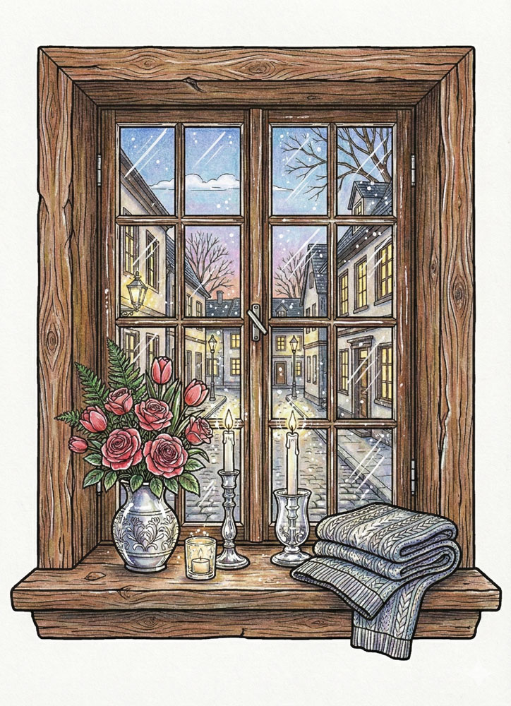
Looking out at a peaceful view or curling up on a window seat inspired these free printable cozy window coloring pages. I formatted these detailed illustrations as high-resolution A4 PDFs with clean, distinct lines, making them a relaxing project for adults and older teens who appreciate realistic interior aesthetics.
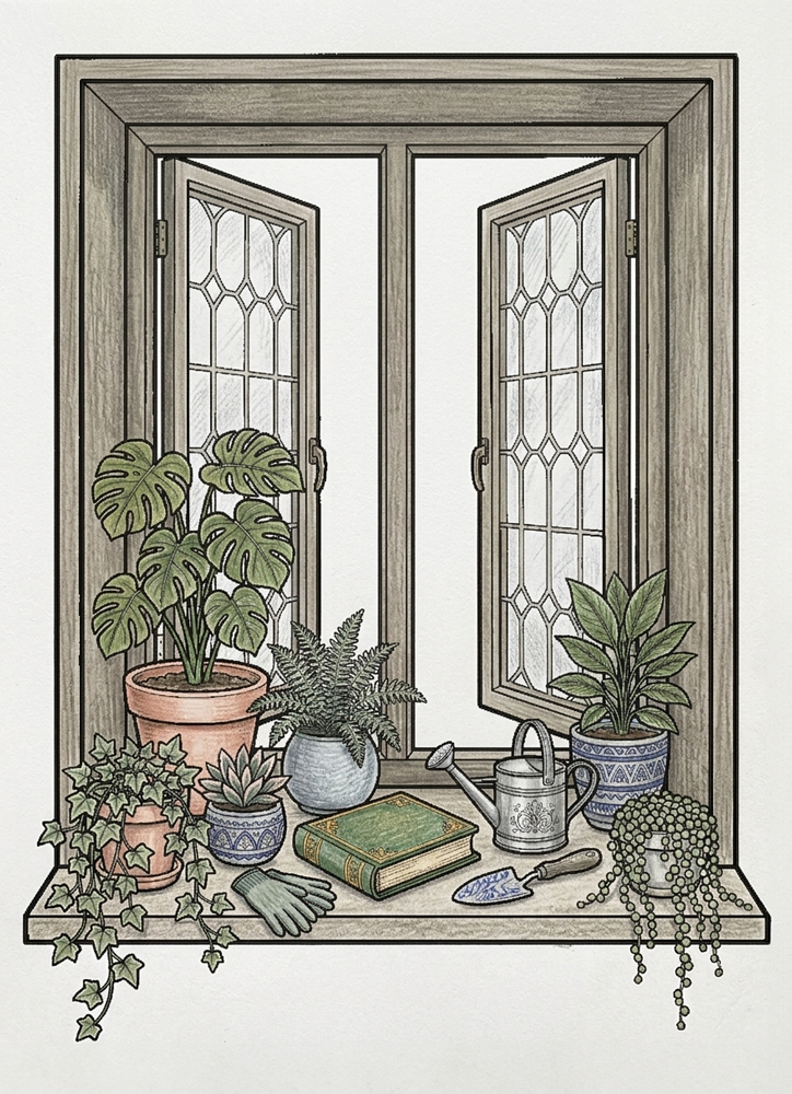
The collection carries a quiet, restful mood, featuring varied settings like rainy day nooks, plant-filled sills, and frosty windowpanes. Further down the page, I’ve included colored examples and two step-by-step tutorials for pencils and markers to help you practice rendering glass textures and natural light. Take your time scrolling through to find a scene to work on.
🎨 Coloring Tips & Inspiration
Try starting with the light instead of the objects. Imagine the time of day outside the window and choose soft or warmer tones to match it. Once the light is there, the whole scene feels cozier, and the rest becomes easier to color.
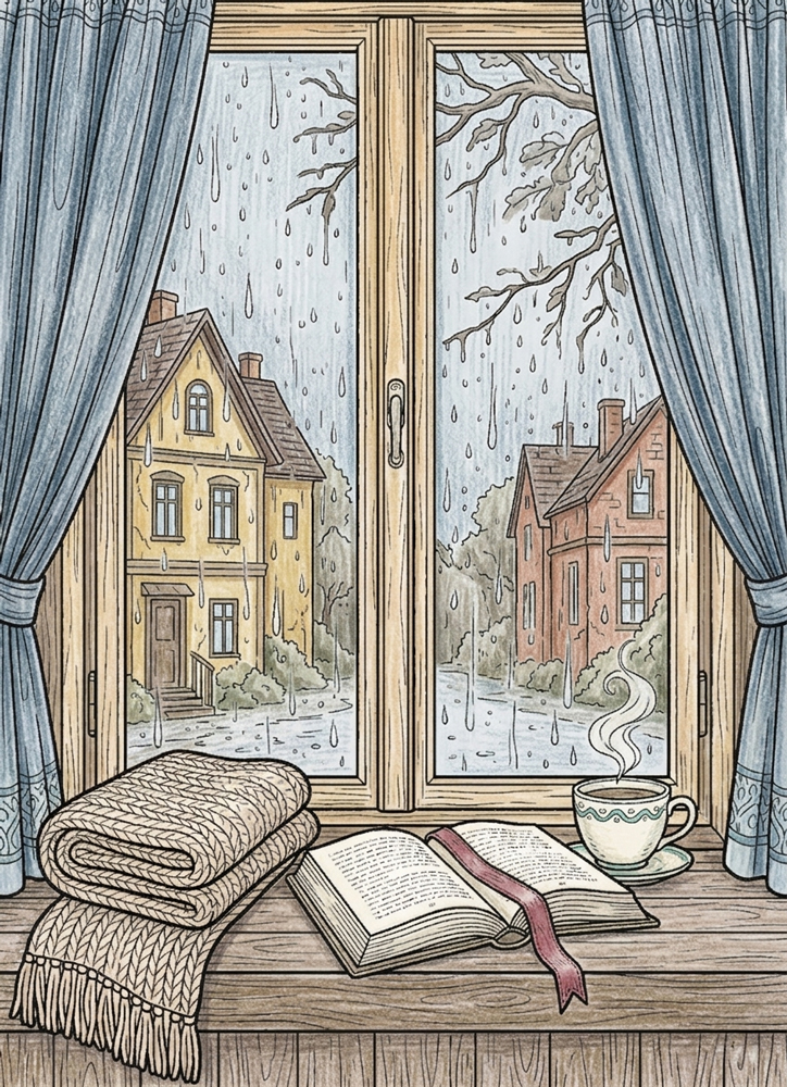
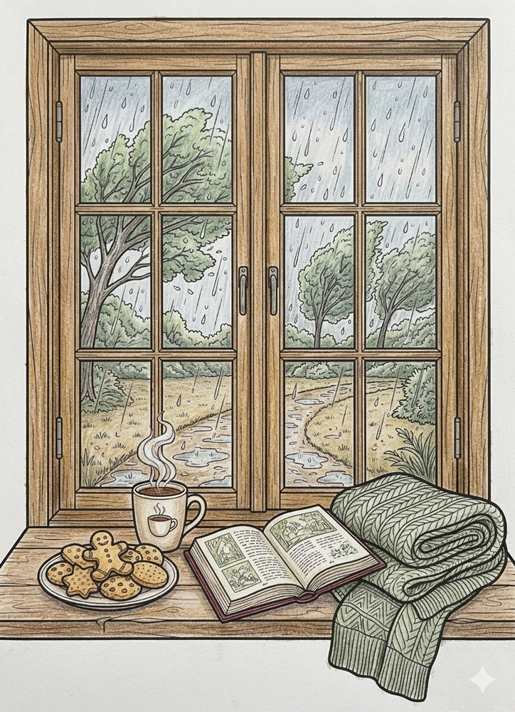
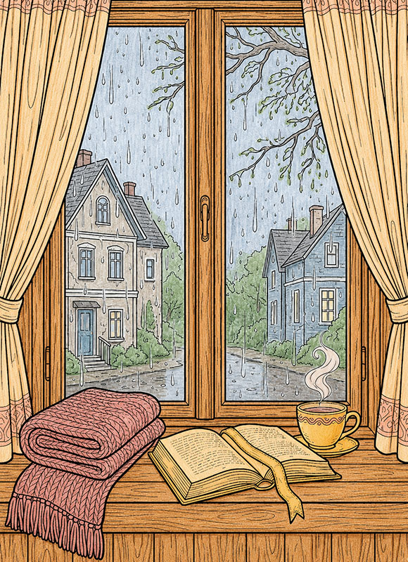
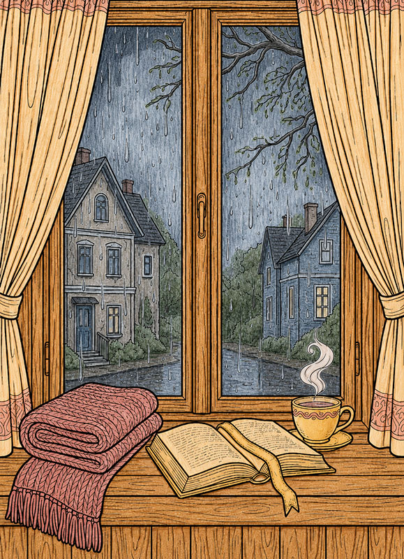
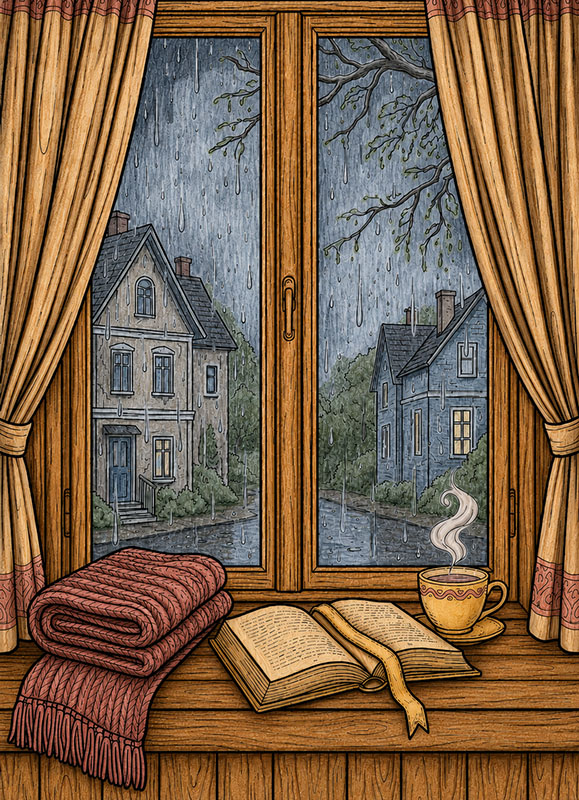
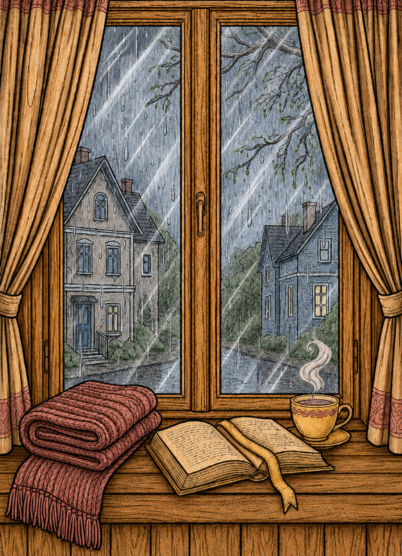
Below are a few colored examples from the cozy window coloring pages collection. They help you feel the atmosphere, but there is no need to copy them exactly. Click on any image to enlarge and explore the details up close. Scroll down, there is a step-by-step tutorial below.
🌧️ Step 1 — Color the Rainy Background
Let’s begin with the rainy scene outside the window.
Use soft gray-blue tones for the sky, muted greens and browns for the trees, and desaturated colors for the distant houses and outdoor ground.
Keep the rain light and subtle so it stays visible against the darker outdoor background.
Use light pressure and visible pencil strokes to keep the soft rainy atmosphere natural and textured.
Leave the curtains, window frame, blanket, book, cup, and all indoor objects completely untouched for now.
☕ Step 2 — Color the Cozy Interior
Now let’s bring warmth into the indoor scene.
Use warm browns for the wooden window frame and windowsill, soft cozy colors for the blanket and curtains, and warm tones for the book and cup.
Keep the steam light and gentle so it still feels soft against the warmer interior colors.
Fill all the indoor objects completely while keeping the pencil strokes visible and natural.
Leave the outdoor rainy background exactly as it is.
🌧️ Step 3 — Deepen the Rainy Atmosphere
Now let’s make the outdoor scene feel darker, rainier, and more atmospheric.
Use darker cool grays and muted blues to darken the upper corners and side edges of the outdoor view while keeping the center area lighter.
Add stronger shadows along the tree branches and under the roofs of the distant houses to create more depth.
You can also slightly darken some rain streaks near the edges of the window to make the rain feel heavier closer to the glass.
Keep the pencil strokes visible and leave all interior objects completely untouched.
🧶 Step 4 — Add Cozy Texture and Shadows
Now let’s make all the indoor objects feel softer, deeper, and more realistic.
For the blanket, add darker strokes between the knitted rows and inside the folds. Follow the woven direction carefully so the texture becomes easier to see.
On the book, darken the center crease between the pages, the small gaps between page layers, and the shadow under the ribbon bookmark. You can also add a little shading near the page corners.
For the cup, add curved shadows along one side and underneath the handle to create a rounded shape. Add a darker shadow directly under the cup on the windowsill.
Deepen the curtain folds with long vertical strokes, darkening the inner folds and tied fabric areas. Add soft curved shadows inside the steam swirls and darker brown lines following the wood grain of the windowsill.
Keep every shadow connected to a fold, curve, overlap, or texture direction so the shapes stay clear and easy to understand.
✏️ Step 5 — Add White Pencil Glass Reflections
Now let’s create the realistic reflective effect that makes the window finally feel like real glass instead of a flat transparent surface.
Take a white colored pencil and work directly on top of the finished glass areas. Start by adding a few long thin diagonal reflection streaks across some of the panes. These lines should cross naturally over the rainy outdoor scene underneath.
Keep the reflection lines slightly uneven and softly broken in places instead of making perfect straight marks. Real window reflections usually shift in thickness and brightness as the light catches different parts of the glass.
You can layer a second lighter white line next to some of the larger reflections to create a more realistic layered glare effect. A few smaller secondary streaks near the main reflections will also help the glass feel more natural.
Add tiny soft white touches near some corners and edges of the panes where reflected light would naturally collect more strongly. Keep these accents small and controlled.
Understanding the Visual Language of the Theme
The visual language of our cozy window scenes is defined by the contrast between interior calm and softened exterior views. In our vertical A4 layouts, the window acts as a portal, and its structure is key to the mood:
- Visual Anchors: Clear window frames provide a solid structure for the composition.
- Layered Depth: Interior and exterior elements are visually separated, creating a sense of “looking through.”
- Filtered Light: Small reflective details and reduced contrast behind the glass suggest a surface that catches the light.
Coloring Techniques / Approach for This Theme
In this theme, glass is treated as an active surface rather than empty space. Here are three professional approaches to suggest depth and light:
1. The Magic White Pen (Mixed Media Highlights)
This is the simplest way to add a clear glass effect after your scene is fully colored. Use a white opaque tool (like a gel pen) to place sharp reflections on top of your colors. A few thin lines along corners or tiny dots for “sparkle” will make the glass pop while letting the colors underneath remain visible.
2. The Hazy Layer (The “Through the Glass” Effect)
To show that the outside view is filtered, try reducing the contrast.
With pencils: Color the outside landscape first, then gently apply a white pencil over the entire window area.
With markers: Use a very light gray or colorless blender to desaturate the landscape colors. This creates a soft, slightly cloudy layer that separates “inside” from “outside.”
3. The Soft Gradient Frame (Depth and Thickness)
Glass often looks heavier near the edges where shadows collect. Apply a pale blue, mint, or light gray tone only near the window frame and gently fade it toward the center. Leaving the center of the window white or very light helps the glass feel clearer and more open.
Pro Tip: These techniques work best on our high-resolution line art, where the clean black outlines provide the perfect “frame” for your light and shadow experiments.

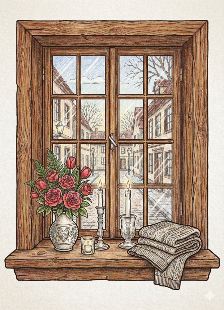
Example 1 The Magic White Pen
This example focuses on using white pen highlights to define the glass surface. Sharp white lines placed along the window edges and small dots on the panes create the impression of reflected light. The underlying colors remain untouched, allowing the glass to feel clear and crisp rather than cloudy. In this example, the scene is colored with colored pencils, but the same approach can also be used with markers before adding white pen accents.
Example 2 The Hazy Layer
In this example, the view behind the window is intentionally softened. A light layer is applied over the outdoor scene to reduce contrast and brightness, making it appear filtered through glass. Clear white highlights are added in selected areas to suggest reflections without breaking the hazy effect. This version is colored with colored pencils, but a similar muted effect can also be achieved using markers and very light tones.
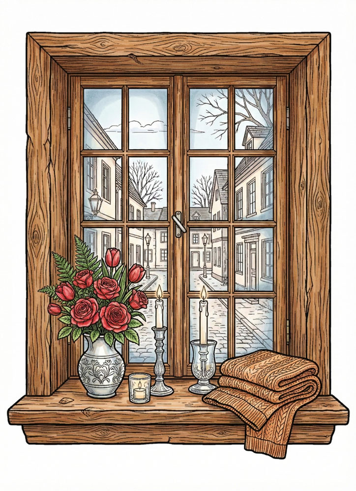
Example 3 The Soft Gradient Frame
This version demonstrates how depth can be suggested near the window frame. Light color is concentrated along the edges and corners, then gradually faded toward the center. The middle of the window stays mostly white, which keeps the glass transparent while giving it a sense of thickness.In this example, the scene is colored with alcohol markers, but the same effect can also be achieved with colored pencils using light pressure and gradual layering.
Artistic Composition and Detail Balance
In these designs, the window frame acts as a natural divider that organizes the entire composition. By keeping the glass area light and airy, we ensure that the interior details remain calm and readable.
The strongest visual contrast is intentionally kept within the room, while the outside view supports the overall mood without drawing attention away from the window itself. This balance is perfectly optimized for our vertical A4 layouts, creating a sense of depth and focus.
Practical Application: How to Use
These cozy window pages are ideal for slow, relaxing coloring sessions where you can focus on light and atmosphere. They are particularly effective for:
- Theme-based sessions: Exploring evening, rainy day, or seasonal coloring moods.
- Technique practice: Experimenting with light, reflection, and transparency on a structured subject.
- Mixed media: Combining pencils for the landscape with white pen accents for glass highlights.
Try using the same scene with different coloring approaches to compare how light and glass effects can completely change the story of the image.
Technical Standards and Download Information
All “Cozy Window” coloring pages are provided as high-resolution printable PDFs designed for a crisp, professional finish. Each page includes:
- Clean black outlines (no black fills) for maximum creative freedom.
- Standard vertical A4 format for easy home printing.
- Compatibility with colored pencils, markers, and opaque white pens.
Download your favorite window scenes, print them out, and enjoy the meditative process of bringing light and depth to life.
✨ Frame Your Favorite Moments of Quiet
If you enjoyed the peaceful views from these windows, your journey into our miniature worlds is just beginning. Explore the hidden treasures in our Magical cabinets, step deeper into warmth with our Cozy interiors, or admire the intricate exterior details of our Whimsical house – Realistic Style. For those who want to see the world outside change color, don’t miss our Fall coloring pages, which perfectly complement the spirit of a cozy afternoon.
Let these detailed scenes inspire your next creative project—from the golden glow of a setting sun to the soft, cool shadows of a rainy window pane.

