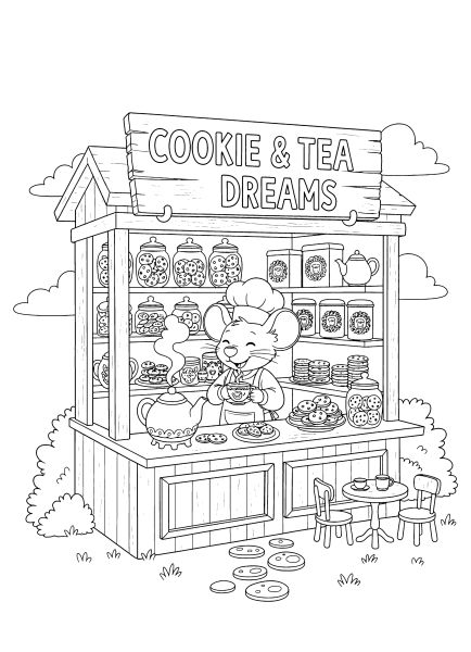
Cute kiosks coloring pages

πŸͺ Cute Kiosks Coloring Pages

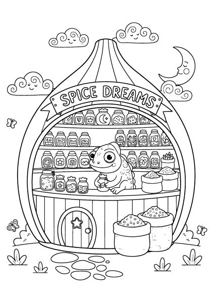
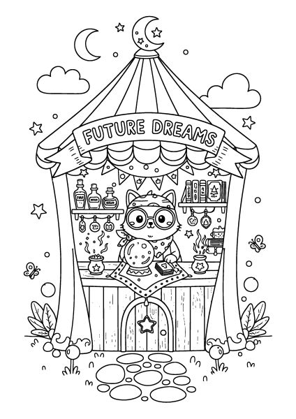
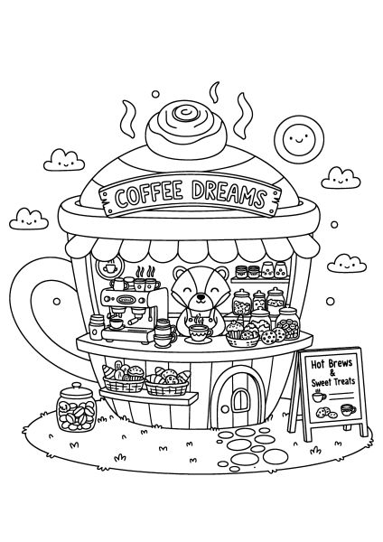
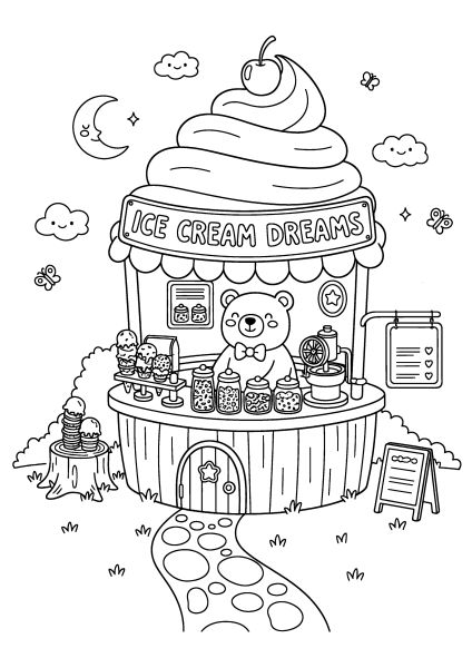
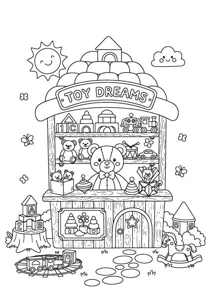
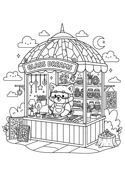
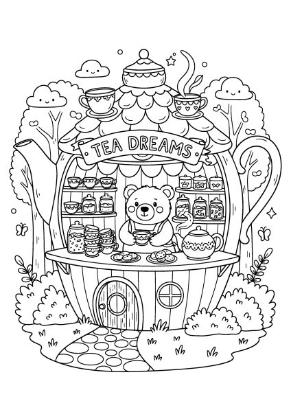
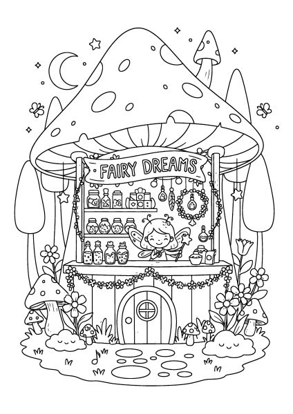
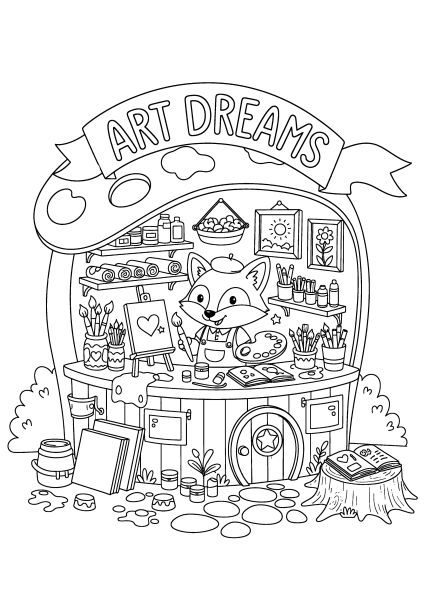
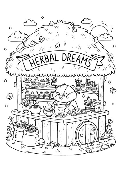
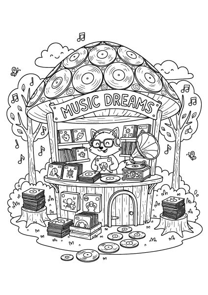
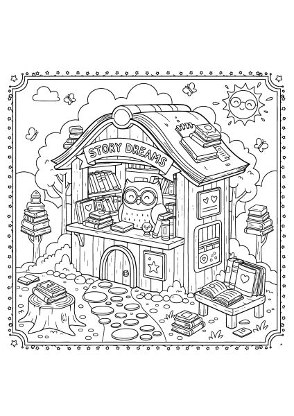
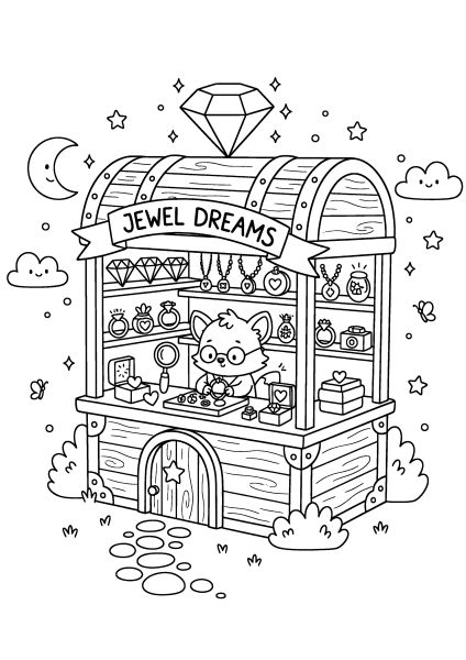
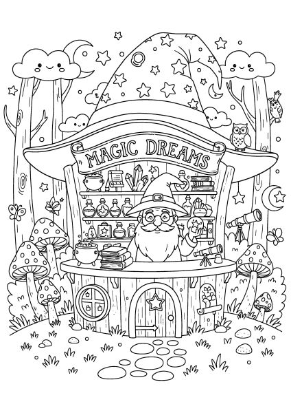
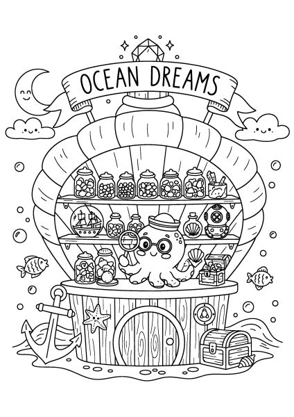
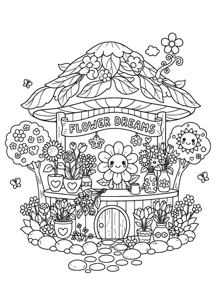
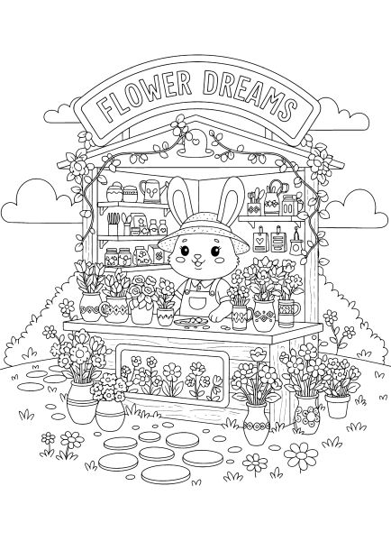
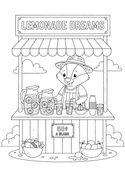
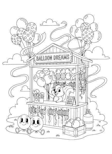
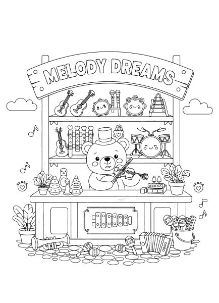
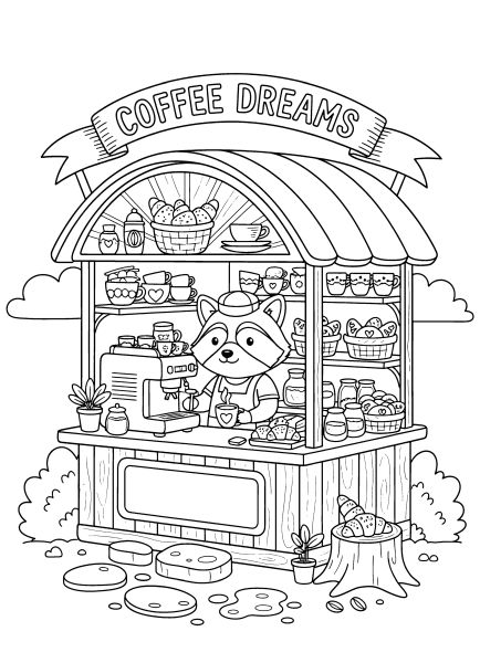
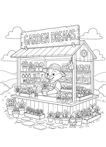
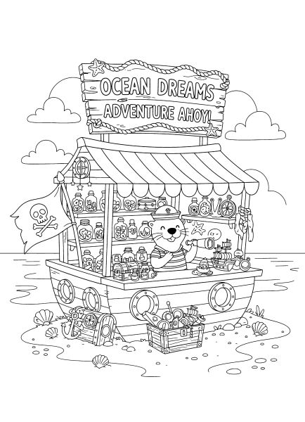
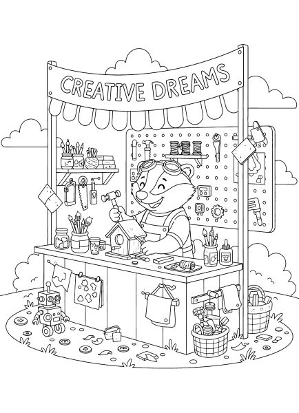
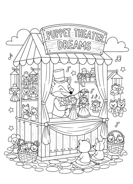
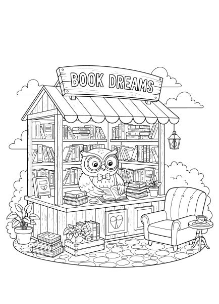
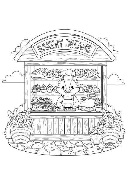
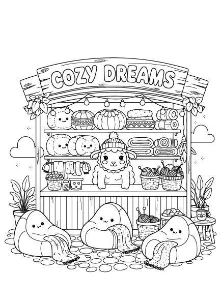
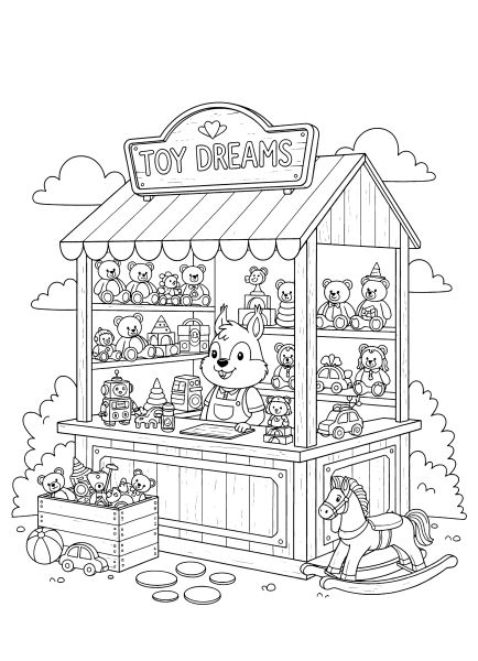
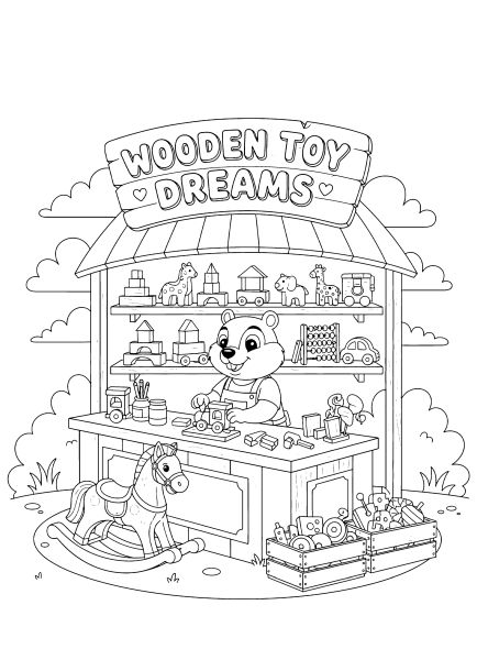
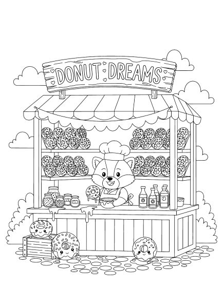
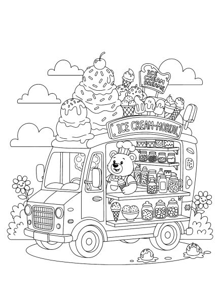
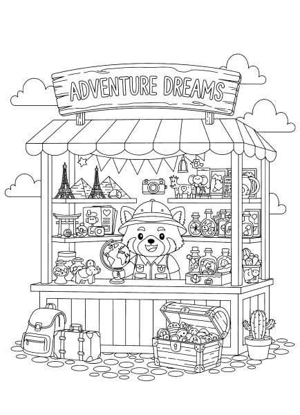
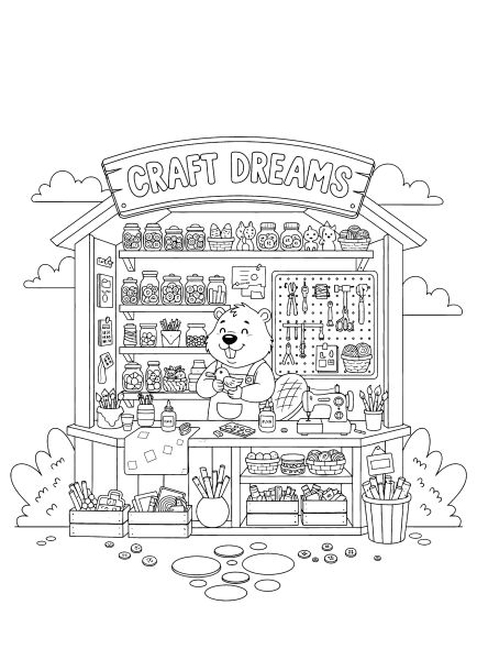
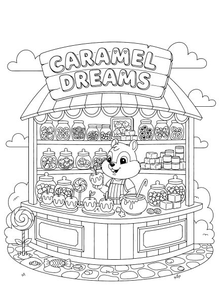
Drawing tiny, detailed shops has always been a relaxing activity for me, which inspired this set of free printable cute kiosks coloring pages. I exported these whimsical little stalls as high-resolution A4 PDFs, making sure the clean lines provide a comfortable canvas for older kids and teens working on a cozy project.

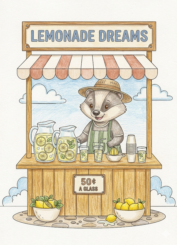
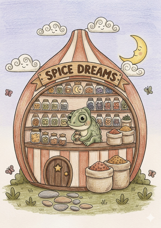
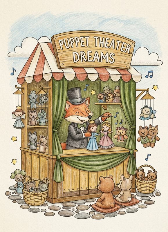
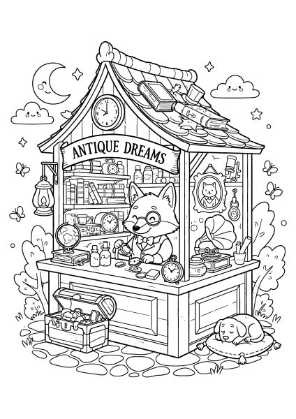
Each illustration highlights a different miniature storefront, ranging from a cozy coffee shop to a magical spice stand run by forest animals. Past the main gallery, I added a few colored examples and two step-by-step tutorials for markers and pencils to help with shading small details like jars and roof tiles. Take a look below to see which little shop you want to color first.

🎨 Coloring Tips & Inspiration

These small kiosks are especially fun to color because they are full of tiny details and cozy elements. Shop windows, signs, and little objects can be kept soft and calm or highlighted with brighter accents. Even if you simply color the drawing neatly without complex effects, it will already look lively and complete.

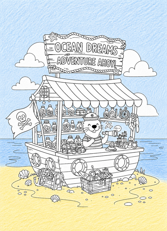
Below are a few colored examples from the cute kiosks coloring pages collection. Use them as a source of ideas and pick what you like most. Click on any image to enlarge and explore the details up close. Scroll down, there is a step-by-step tutorial below.

❄️ Winter Coloring Made Simple

This page is all about slow, cozy coloring. You don’t need to plan anything ahead β€” just take your pencils and move step by step.

We’ll start with the main character, then gently add the rest of the scene around it. Each step is small and easy, so you can enjoy the process without feeling rushed.

Keep it light, keep it simple, and don’t worry about perfection β€” the charm is in the little imperfections.

🌊 Step 1 β€” Start with the Background

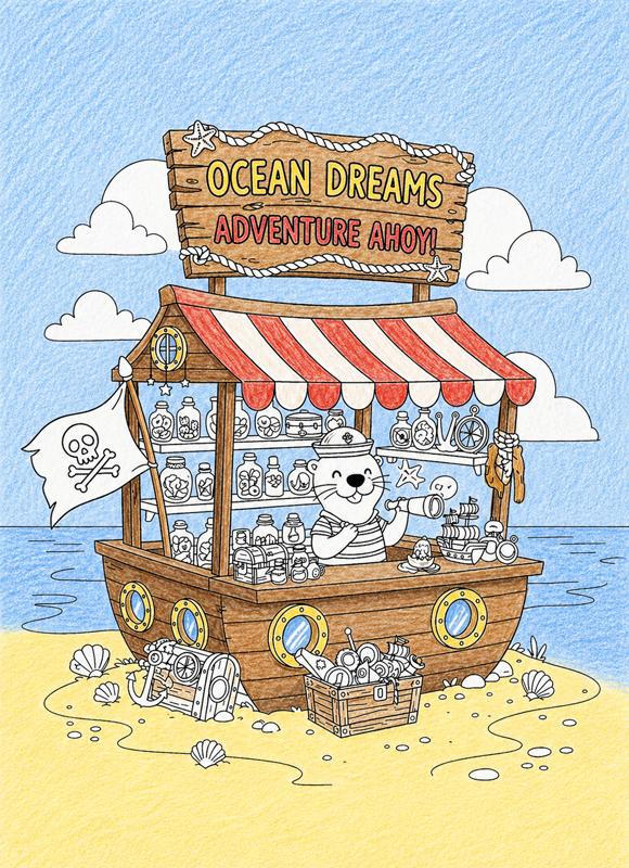
Let’s begin with the big areas β€” the sky, the ocean, and the sand.

Take a light blue pencil for the sky and water, and a soft yellow for the sand. Gently fill in these areas with a light, even layer.

Keep your hand relaxed so the color stays soft. It’s perfectly fine if you can see the pencil strokes β€” that makes it look more natural.

For now, just focus on laying down a clean base color. No shading yet.

Leave the kiosk, the otter, and all the objects untouched.

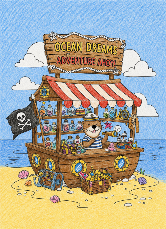
β›΅ Step 2 β€” Color the Kiosk Structure

Now let’s move on to the main part of the kiosk.

Take brown for the wooden parts, and red and yellow for the striped awning and signs. Start filling in the whole structure β€” the body of the kiosk, the awning, and the wooden signs on top.

Use steady, simple strokes. Don’t try to make it perfectly smooth β€” a slightly hand-drawn look is just right here.

For now, keep it flat and simple, without adding any shadows.

Leave the otter, the flag, and all the small items inside the kiosk just as they are.

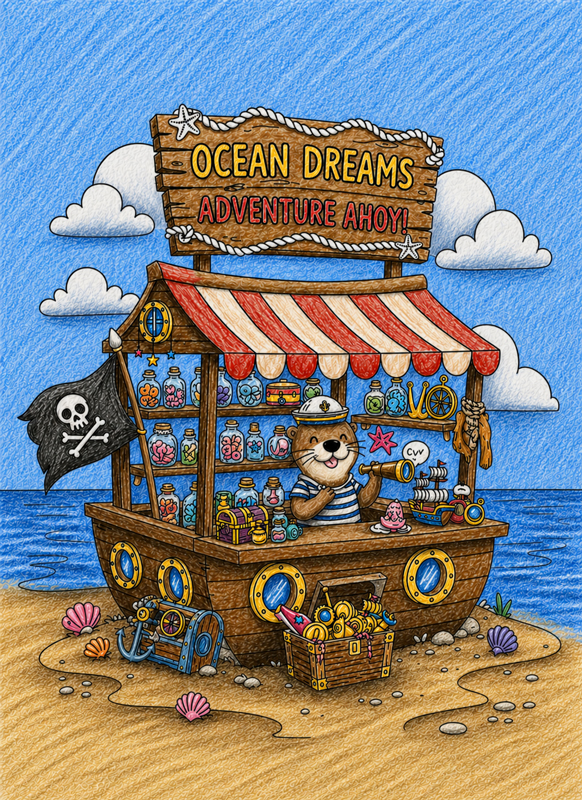
🦦 Step 3 β€” Color the Otter and Details

Now let’s bring the character and all the little details to life.

Start with the otter β€” color the fur and clothes using soft, natural tones. Then move to the pirate flag, the chests, the jars on the shelves, and the shells on the sand.

Use different colors and fill each area fully. It’s okay if your pencil strokes are visible β€” that gives the drawing a nice, handmade feel.

Take your time and make sure all the small parts are colored in.

Leave the background and the wooden kiosk just as they are.

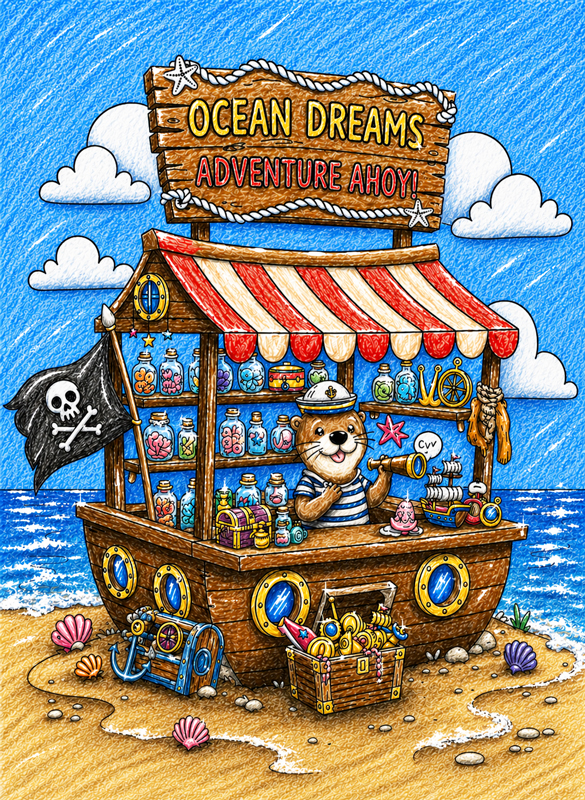
πŸŒ— Step 4 β€” Add Depth to the Whole Scene

Now let’s make everything feel more alive and three-dimensional.

Take darker shades of the same colors and start adding shadows in a few key places. On the clouds and water, add a few stronger strokes to suggest depth and movement.

On the sand, add a bit of shadow under the objects so they don’t look like they’re floating. Then move to the otter β€” darken areas under the paws and around the neck.

Add a few darker strokes to the flag to show folds, and lightly go over some parts of the wooden beams and shelves.

Β 

✨ Step 5 β€” Add Bright Highlights

Now let’s add the final sparkle.

Take a white gel pen or marker and add tiny bright spots in the otter’s eyes, on the glass jars, and on the gold coins.

Then move to the ocean. Add a few thin white strokes along the tops of the waves, and a little foam near the shoreline.

Keep the marks clear and bright, but don’t cover large areas. These are just small finishing touches.

Now the scene has that final shiny look, and the sea feels much more alive.

Enjoying these free coloring pages?
Your support helps keep this free printable library growing.
The support amount starts at $3, but you can change it before donating. You can also choose one-time or monthly support.
Need another payment option? Open the full Ko-fi page .

Understanding the Visual Language of the Theme Cute kiosks coloring pages

Visually, these pages rely on compact structures, clear outlines, and layered details. The kiosk usually occupies the center of the vertical A4 composition and is built from distinct sections:

  • Structural layers: roof, counter, and shelves.
  • Decorative elements: jars, signs, and hanging items that create a cozy rhythm.
  • Rounded linework: confident, soft outlines that support a welcoming look.

Details are dense inside the kiosk area and more open around it. This contrast helps the eye focus on the stall while the surrounding space stays calm and readable, preventing visual overload.

Coloring Techniques / Approach for This Theme

For detailed, cozy scenes like these, we recommend two complementary approaches that keep the illustration tidy and charming.

1. Color Blocking for Structure
Color blocking means filling each main area with a clean, flat color before adding any depth. In kiosk scenes, this helps separate functional zones like the roof, counter, and shelves. By doing this first, the structure stays clear even when there are many small objects to color later.

2. Highlight Accents for a Cozy Effect
Highlight accents are small, light touches added after the main coloring is complete. Use them sparingly as tiny white dots or lines to suggest shine on glass jars, metal details, or decorative signs. These accents add a professional “pop” without disrupting the overall softness of the image.

3. Keep the Background Light
Because the kiosk itself is highly detailed, we intentionally keep the background open. Use a softly blended pencil layer to suggest the sky or ground. This adds depth while ensuring the kiosk remains the undisputed star of the page.

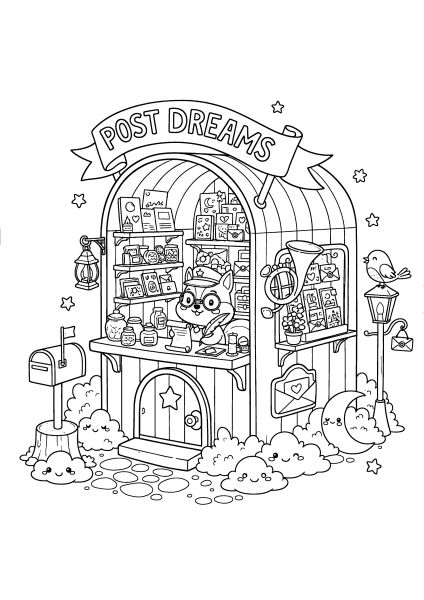
Artistic Composition and Detail Balance

Kiosk coloring pages work best when the kiosk remains the undisputed focal point. To achieve this, we follow a specific design logic:

  • Focal Point Priority: Attention is naturally drawn to the counter, central decorations, or the character inside.
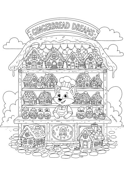
  • Background Simplicity: A lighter or simpler background helps the rich interior details of the stall stand out clearly.
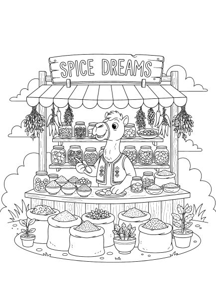
  • Selective Detailing: Not every object requires the same level of focus. Some areas are left simpler to guide the viewer’s eye effectively.

This balance ensures the vertical A4 composition feels organized and easy to read, rather than crowded or chaotic.

Practical Use: How to Enjoy These Pages

These illustrations are designed for calm, focused sessions where you move gradually from one small section to another. They are perfect for:

  • themed activities inspired by markets, festivals, or imaginary storybook towns
  • creative storytelling projects where each kiosk represents a different shop or character
  • practicing neat coloring and color separation without the need for complex shading

Who These Pages Are Best For

The overall mood of this collection is calm and inviting, making it a great fit for:

  • Children (7+): Who enjoy exploring detailed scenes and creating their own little worlds.
  • Teens: Who like friendly, whimsical illustrations for relaxation or journaling.
  • Adults: Who prefer “cozy” coloring with many small, decorative elements to focus on.

Technical Standards and Download Information

All kiosk and stall coloring pages are provided as high-resolution printable files. Each page features clean, evenly weighted outlines optimized for colored pencils, markers, or crayons. Files are compatible with standard home printing on A4 or US Letter paper.

Download, print, and start building your own colorful marketplace step by step.

🏘️ Discover More Charming Structures

After bringing these adorable stalls to life, continue your architectural journey through our other cozy collections. You can step inside with our Cozy interiors, or explore the magical exteriors of our Whimsical House series, available in both Cartoon and Realistic styles. If you enjoy the charm of small shops and want to try a physical creative challenge, don’t miss our 3D Bakery Shop, where you can build your own miniature storefront.

Let these detailed designs inspire your paletteβ€”from bright, inviting signage to the weathered textures of a vintage street-side kiosk.

cozy interior coloring pages with warm rooms and home details

Cozy Interiors Coloring Pages

Cozy interior pages focus on warm, inviting indoor spaces. Furniture, decor, and room layouts are arranged to suggest comfort and everyday life. This subcategory supports slower, detail-oriented coloring and appeals to those who enjoy interior design, atmosphere, and the feeling of enclosed, personal spaces.

cartoon style houses and interiors coloring pages with simple shapes

Whimsical House Coloring Pages – Cartoon Style

Cartoon-style whimsical houses focus on simplified shapes and playful proportions. Details are lighter and more expressive, giving each house a friendly and approachable character. This subcategory works well for relaxed coloring sessions and for those who enjoy imaginative architecture without heavy detail density.

whimsical houses and interiors coloring pages with fantasy architecture

Whimsical House Coloring Pages – Realistic Style

These pages present imaginative houses with a more realistic architectural approach. Textures, proportions, and structural details are emphasized, creating scenes that feel grounded while still playful. They are well suited for colorists who enjoy careful shading, material variation, and exploring how light and color interact with detailed structures.

pinit fg en rect red 28

Scroll to Top