Cozy Window Coloring Pages
🪟 Free Printable Cozy Window Coloring Pages
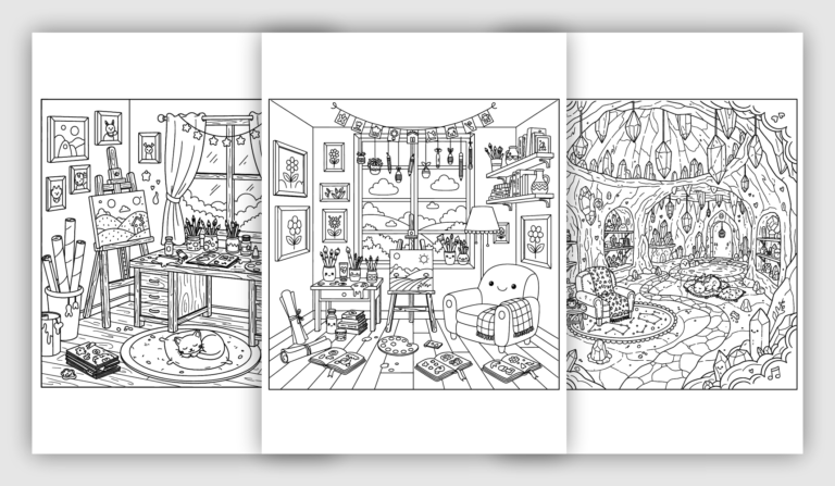
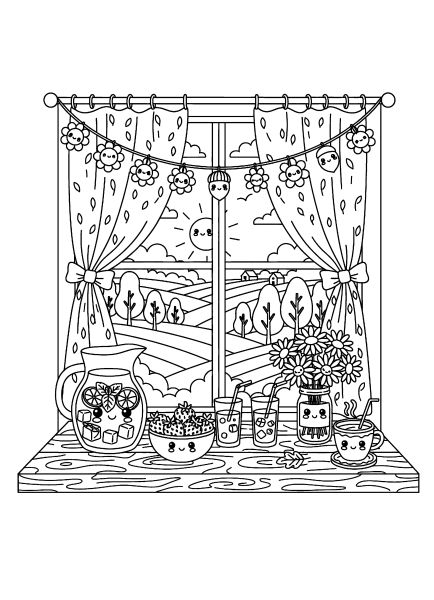
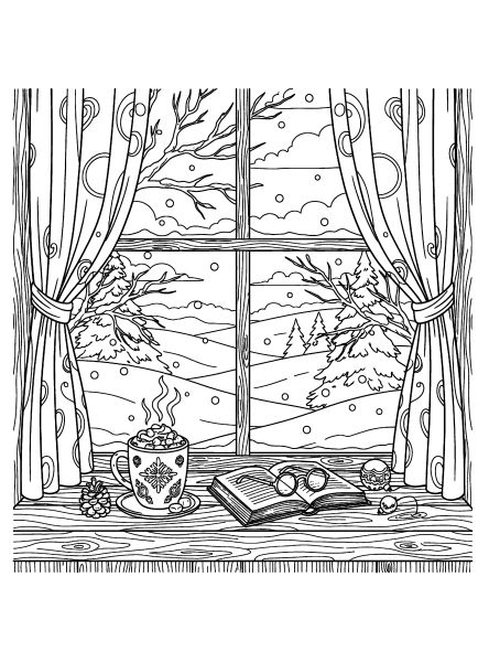
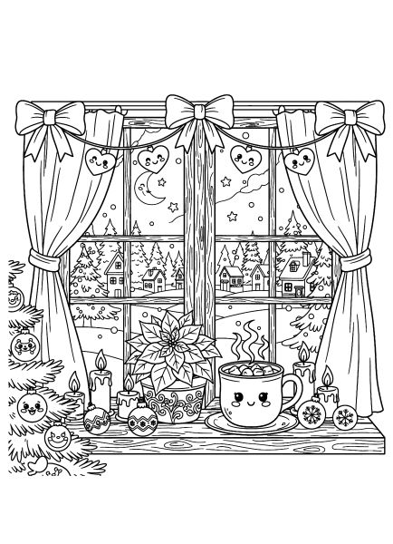
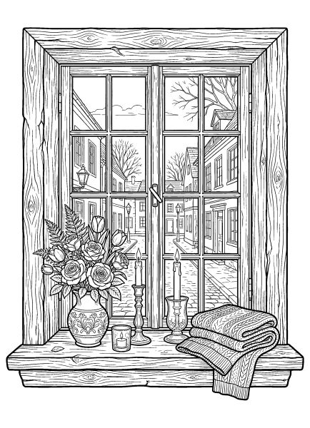
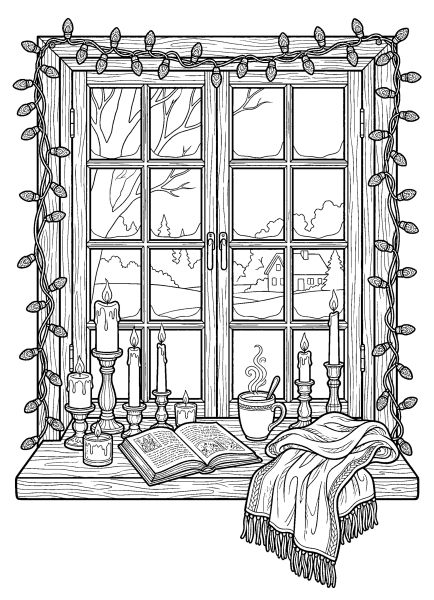
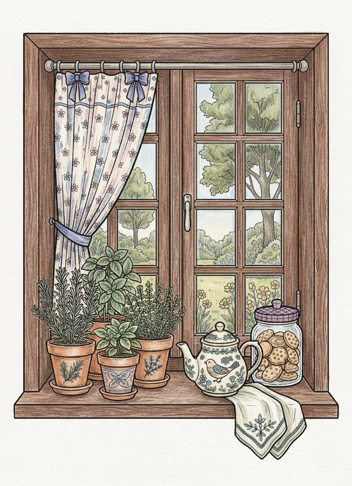
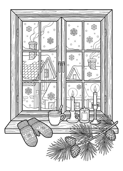
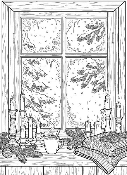
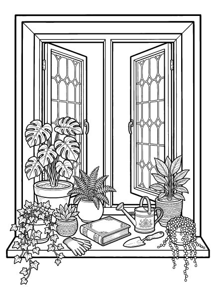
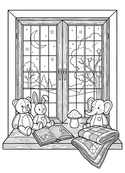
These free printable cozy window coloring pages feature inviting views framed by curtains, wooden windowpanes, and decorated windowsills. Each illustration is available as an individual A4 PDF. The pictures focus on windows rather than entire rooms, capturing the contrast between familiar objects indoors and the changing scenery outside. You'll find rainy streets, snowy cottages, countryside landscapes, and quiet evening views, with books, teacups, flowers, candles, and blankets arranged beside the glass. The collection includes both playful seasonal illustrations and detailed window scenes with intricate architectural and decorative elements.
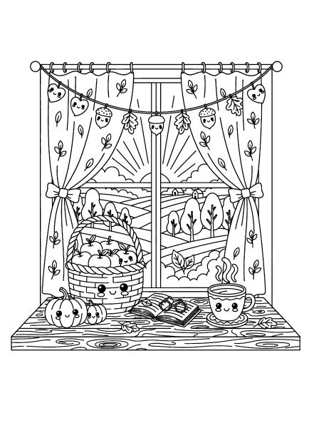
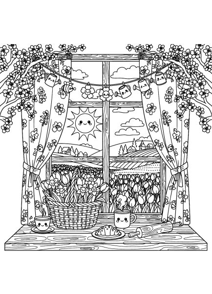
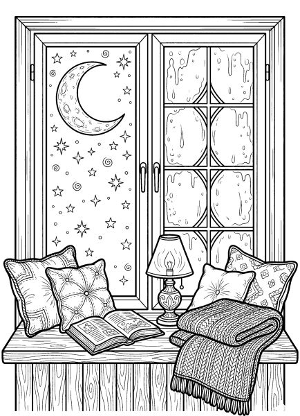
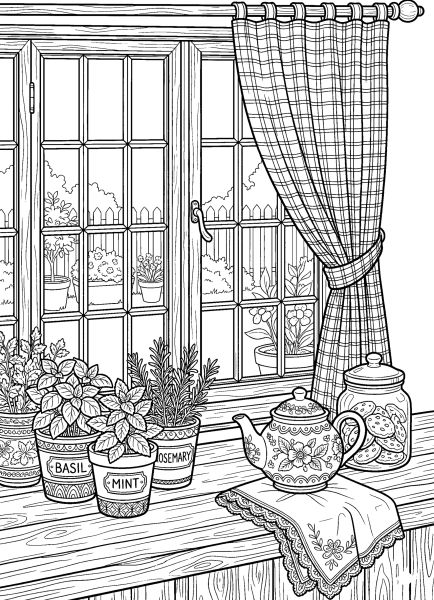
The window coloring sheets reflect different seasons, weather conditions, and times of day. Spring scenes feature flowering plants, sunny landscapes, and cheerful decorations, while autumn windows overlook changing leaves and display pumpkins or warm drinks. Winter illustrations include snow-covered trees, Christmas decorations, village rooftops, and frosty branches. Rainy windows reveal quiet streets and gardens, often with an open book waiting on the sill. Other pictures feature moonlit skies, potted herbs beside a kitchen window, and comfortable reading spots surrounded by cushions and soft furnishings.
🎨 Color Ideas for Cozy Windows and Seasonal Views
The window frame can establish the character of the whole picture. Warm oak, honey brown, or dark walnut can give wooden frames a traditional appearance, while cream, pale sage, and muted blue offer softer alternatives. Curtains can be colored in shades that complement the surrounding objects, with their folds slightly darker than the main fabric. For a cozy interior, try combining warm browns, muted reds, and soft yellows around books, candles, and teacups. Cooler colors beyond the window help distinguish the outdoor landscape from the sheltered space inside.
Weather and seasonal details provide opportunities for different palettes. Rainy window views can use blue-gray skies, subdued rooftops, and darker tree branches. Snowy scenes work well with white spaces and pale blue or lavender shadows, while autumn landscapes suit gold, rust, and orange. Spring flowers can introduce brighter pinks, yellows, and greens. To suggest glass, leave most windowpanes uncolored and add only faint touches of blue or gray where reflections or raindrops appear. These are possible color combinations, not fixed rules, and you can choose your own approach to every picture. Click on any image to enlarge and explore the details up close.
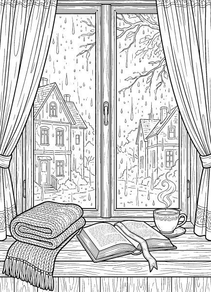
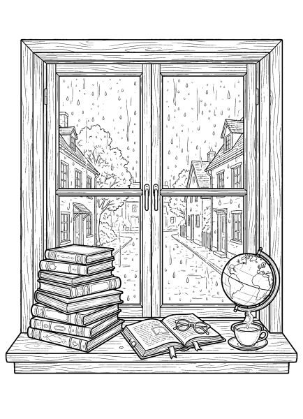
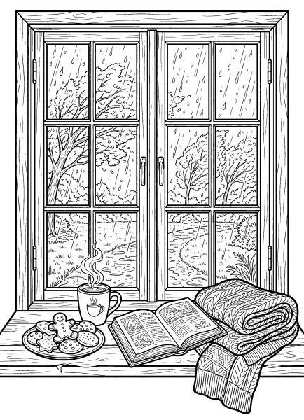
🌧️ Step 1 — Color the Rainy Background
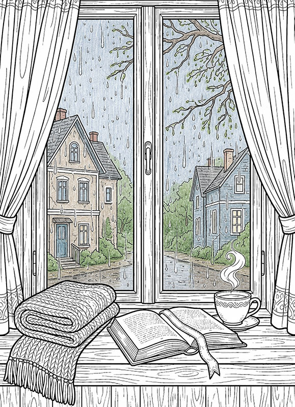
Let’s begin with the rainy scene outside the window.
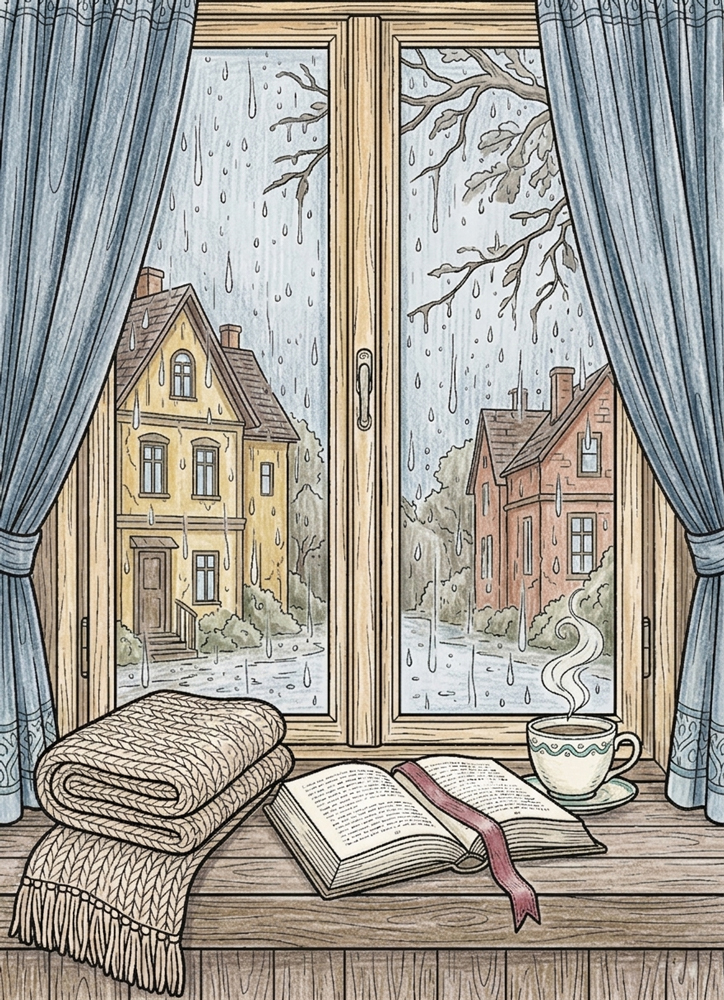
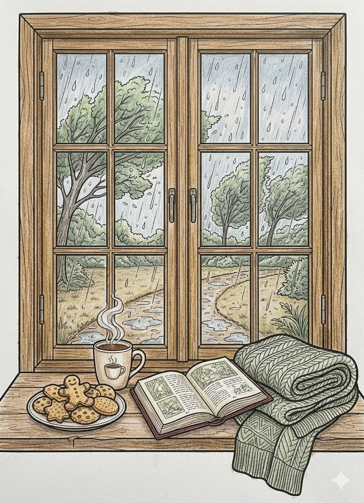
Use soft gray-blue tones for the sky, muted greens and browns for the trees, and desaturated colors for the distant houses and outdoor ground.
Keep the rain light and subtle so it stays visible against the darker outdoor background.
Use light pressure and visible pencil strokes to keep the soft rainy atmosphere natural and textured.
Leave the curtains, window frame, blanket, book, cup, and all indoor objects completely untouched for now.
☕ Step 2 — Color the Cozy Interior
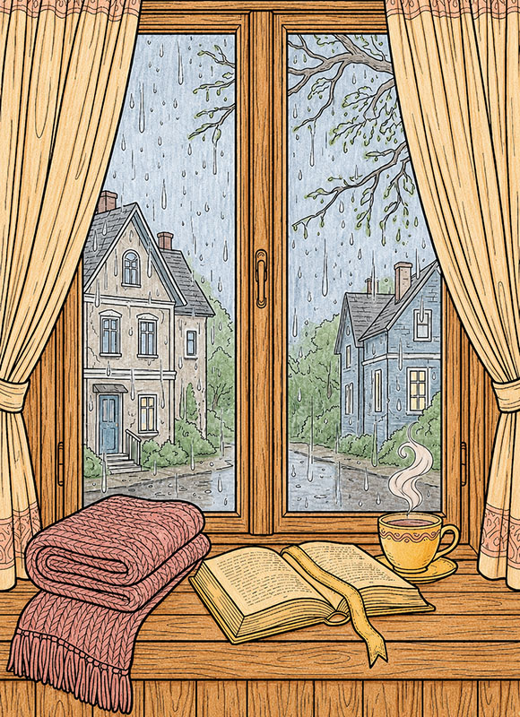
Now let’s bring warmth into the indoor scene.
Use warm browns for the wooden window frame and windowsill, soft cozy colors for the blanket and curtains, and warm tones for the book and cup.
Keep the steam light and gentle so it still feels soft against the warmer interior colors.
Fill all the indoor objects completely while keeping the pencil strokes visible and natural.
Leave the outdoor rainy background exactly as it is.
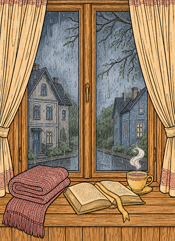
🌧️ Step 3 — Deepen the Rainy Atmosphere
Now let’s make the outdoor scene feel darker, rainier, and more atmospheric.
Use darker cool grays and muted blues to darken the upper corners and side edges of the outdoor view while keeping the center area lighter.
Add stronger shadows along the tree branches and under the roofs of the distant houses to create more depth.
You can also slightly darken some rain streaks near the edges of the window to make the rain feel heavier closer to the glass.
Keep the pencil strokes visible and leave all interior objects completely untouched.
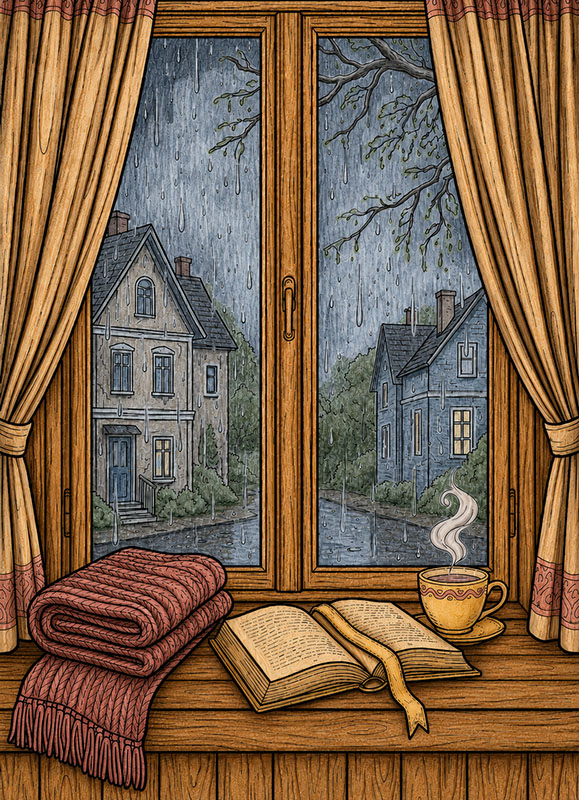
🧶 Step 4 — Add Cozy Texture and Shadows
Now let’s make all the indoor objects feel softer, deeper, and more realistic.
For the blanket, add darker strokes between the knitted rows and inside the folds. Follow the woven direction carefully so the texture becomes easier to see.
On the book, darken the center crease between the pages, the small gaps between page layers, and the shadow under the ribbon bookmark. You can also add a little shading near the page corners.
For the cup, add curved shadows along one side and underneath the handle to create a rounded shape. Add a darker shadow directly under the cup on the windowsill.
Deepen the curtain folds with long vertical strokes, darkening the inner folds and tied fabric areas. Add soft curved shadows inside the steam swirls and darker brown lines following the wood grain of the windowsill.
Keep every shadow connected to a fold, curve, overlap, or texture direction so the shapes stay clear and easy to understand.
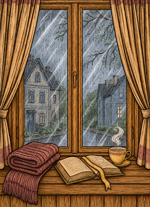
✏️ Step 5 — Add White Pencil Glass Reflections
Now let’s create the realistic reflective effect that makes the window finally feel like real glass instead of a flat transparent surface.
Take a white colored pencil and work directly on top of the finished glass areas. Start by adding a few long thin diagonal reflection streaks across some of the panes. These lines should cross naturally over the rainy outdoor scene underneath.
Keep the reflection lines slightly uneven and softly broken in places instead of making perfect straight marks. Real window reflections usually shift in thickness and brightness as the light catches different parts of the glass.
You can layer a second lighter white line next to some of the larger reflections to create a more realistic layered glare effect. A few smaller secondary streaks near the main reflections will also help the glass feel more natural.
Add tiny soft white touches near some corners and edges of the panes where reflected light would naturally collect more strongly. Keep these accents small and controlled.
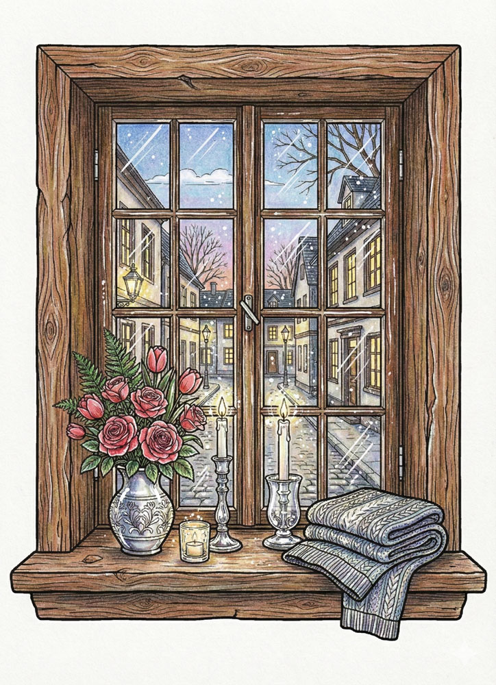
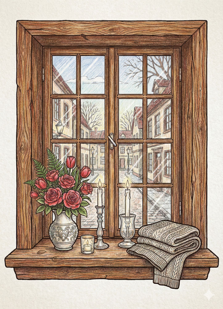
Example 1 The Magic White Pen
This example focuses on using white pen highlights to define the glass surface. Sharp white lines placed along the window edges and small dots on the panes create the impression of reflected light. The underlying colors remain untouched, allowing the glass to feel clear and crisp rather than cloudy. In this example, the scene is colored with colored pencils, but the same approach can also be used with markers before adding white pen accents.
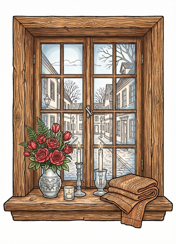
Example 2 The Hazy Layer
In this example, the view behind the window is intentionally softened. A light layer is applied over the outdoor scene to reduce contrast and brightness, making it appear filtered through glass. Clear white highlights are added in selected areas to suggest reflections without breaking the hazy effect. This version is colored with colored pencils, but a similar muted effect can also be achieved using markers and very light tones.
Example 3 The Soft Gradient Frame
This version demonstrates how depth can be suggested near the window frame. Light color is concentrated along the edges and corners, then gradually faded toward the center. The middle of the window stays mostly white, which keeps the glass transparent while giving it a sense of thickness.In this example, the scene is colored with alcohol markers, but the same effect can also be achieved with colored pencils using light pressure and gradual layering.
☕ What Makes These Window Coloring Pictures Special
An interesting feature of these illustrations is their consistent point of view. Instead of showing the outside of a house, the drawings place you beside a window, looking through the glass toward the world beyond. The window frame becomes a boundary between nearby objects and distant scenery. A flowerpot or teacup occupies the foreground, while trees, houses, and hills appear farther away. This arrangement gives even a relatively simple drawing a sense of space. The differences in scale between the objects on the sill and the landscape outside are worth noticing when choosing colors.
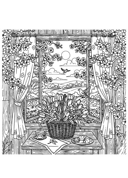
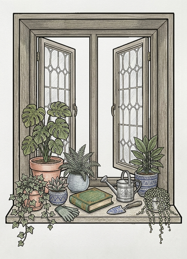
The windows themselves vary in shape and construction. Some have broad wooden frames and small divided panes, while others feature tall glass sections, open casements, or decorative details. Curtains may hang loosely, be gathered to the sides, or display repeating floral patterns. In certain pictures, the arrangement of panes divides the outdoor view into smaller sections, each containing part of a tree, building, or landscape. Following these divisions carefully helps preserve the appearance of a single continuous scene beyond the glass.
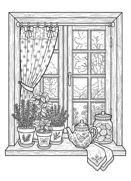
Small everyday objects are an important part of the artwork. An open book beside a steaming mug suggests a quiet reading break, while herb pots and a teapot give a kitchen window its own character. Other scenes include candles, knitted mittens, folded blankets, flower arrangements, or childhood toys. These details can suggest different activities without showing any people. A few carefully chosen accent colors can draw attention to the objects that give each window its particular atmosphere.
There is also a noticeable contrast between the playful and more detailed illustrations. Some seasonal windows have smiling decorations, expressive cups, and simple countryside backgrounds. Others emphasize wood grain, candleholders, plant leaves, patterned curtains, and the architecture of houses visible through the panes. The drawings with larger windows and relatively open landscapes allow for broader areas of color. More intricate compositions, especially those with closely spaced plants or detailed street views, are well suited to colored pencils and careful work around small outlines.
Each design is available as an individual printable A4 PDF, allowing you to choose a particular window view, season, or level of detail. Print at 100% scale to preserve the original proportions and fine outlines, particularly around windowpanes, curtain patterns, small flowers, and raindrops. Colored pencils provide good control for wood grain, foliage, and narrow architectural details, while crayons or markers can be useful for larger sections of curtains and scenery. If using markers, place an extra sheet beneath the print to protect the surface below.